All Stories

Friday, December 18, 2020


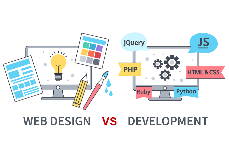
I remember in my early stages of learning web development, that I found myself confused multiple times about the differences between design and development. What are the roles of a web designer? What is involved in working with web design? Are web design and web development the same? Are they interchangeable terms with the same meaning?

The simple answer would be no. The role of each is completely different from the other. But let’s have a look into the different roles and methods, of both a web designer and a web developer.

Web design

Think about web designers as those who transform an idea, or a story, into a visually appealing design, and use their layout to build the user experience throughout the whole website. They design the website’s look and feel. As an architect would create a plan of your house prior to start building it, similarly a web designer would model the layout of your website before a web developer can start developing it.

Web designers have a difficult role which is often underrated. In their designs they need to integrate the best user experience possible, and create a welcoming environment for the user. They have to change an idea from writing, into a usable design and interface that catches the user’s attention. A website cannot be described as great if a proper design strategy wasn’t applied into the early stages of the project. Nowadays, web designers are rated at the same level of web developers, as without a great user experience and design, the development cannot be truly appreciated by the user.

Web designers have built a whole library of strategic techniques for themselves. You don’t just create a perfect website immediately after reading or thinking about the specifications or the features required. You start with a scope — the focus point and the purpose that the website will offer. You would first roughly envision the designs in your head, and start with a sketch or draft of the design. From sketching, web designers move to wireframes, mock-ups, and to the final design. Professional web designers build the whole website in design components, with a pixel perfect layout of all the web pages, icons, typography and other intricate features.

These are some of the main roles of a web designer:

  • Using software tools such as Adobe Photoshop, Framer, or Sketch to build the final layout design of the website
  • Have good skills in graphic design and logo design
  • Have a good feel for user experience, to identify the simplest approach possible to attain the desired function. This includes the layout, buttons, images and the general format of the website.
  • Web designers need to keep themselves up to date with the latest design trends. It’s also important to keep design consistency that is made popular from other web giant companies, such as Google, and Facebook. This makes the website environment and interface easier to navigate and use, as it is already familiar to the users eyes.
  • Web designers have to also keep in mind the branding of the website, colour palettes to be used, and the typography and readability of the website.

Web development

Think about web developers as those who turn the designs into a live website. Web developers uses web languages and software tools to develop the design and functionality of a website. Notice, that web developers are further split into two sub-categories; front-end developers, and back-end developers. I see front-end developers as the connection between both web designers and back-end developers, as having a little knowledge of both, would allow a front-end developer to build a fully working website. A front-end developer is the one who builds the interface, and provides the layout as the interaction between the back-end of the website and the user.

Front-end developers use three main languages; Hypertext Markup Language (HTML), Cascading Style Sheets (CSS), and JavaScript (JS). With these languages, a developer is able to create a full-fledged website. From the main design layout, to inserting images, applying different types of typography and font families, implementing animations, the flow of different pages, form interfaces, and more.

Back-end developers are those who control the server data and requests. Usually a website requires back-end services if it contains dynamic data. This means, for example, users submitting a form with personal data (such as creating an account), or saving an article for your blog page. Generally, if the website requires data to be saved, and making it accessible at a later stage, it means that it would also need a database connection. Database connections are made possible by a direct connection from the server itself. Thus, a back-end developer then uses server languages such as PHP or ASP.NET, and writes database queries by using languages such as SQL or MySQL.

Here are some of the main roles of a web developer:

  • Building the actual interface through which a user interacts with the website. This interface is built by front-end developers using HTML, CSS, and JS languages.
  • Front-end developers can use styling preprocessors, javascript libraries, and frameworks to fasten the process of development 
  • Front-end developers provide the markup design to back-end developers, so they can implement a dynamic website, and submit all the required data on the server and databases.
  • Back-end developers create the backbone of the website using languages such as PHP and MySQL.
  • Both front-end and back-end developers can use the same development environments or IDEs (Integrated Development Environment). These are software application tools where you code and build the structure of the website.
  • Web developers may also use versioning tools to keep a history of the previous builds. This will help them to quickly and effortlessly move back to a previous “unbroken” version if required to do so.

Closing thoughts
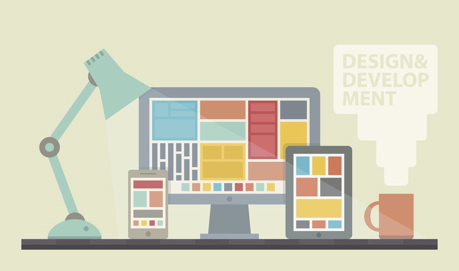
Design vs Development

What does a full-stack developer do?

Full-stack developers are those who have a good knowledge of all of the development areas discussed above. This means that if you are a full-stack developer, you should be able to build a website from scratch, from looking at a design, and creating the mark-up of the design, up to handling back-end processes, and database queries. Usually a full-stack developer would also have a basic knowledge of design and user-experience. Being a full-stack developer does not mean you have to be an expert on all of the languages. It’s already hard to become an expert, or a professional on just one of the languages. It’s also hard to learn all the best techniques and strategies on how to be most efficient in all of the areas we discussed above. Remember, web technologies are evolving everyday.

Having a basic knowledge of everything regarding the web is always a plus, but I recommend you stick with the one you enjoy the most, and focus on becoming an expert on that. Once you feel comfortable with developing the front-end or back-end, you can then dedicate more time for those areas that need more attention.

I hope you now have a clearer understanding of the difference between the roles of web developers and web designers. Keep in mind that both have essential roles, and the web would not exist without one or the other. I can tell you that from my experience nothing will come easier then the rest. Working full-time as a front-end developer, and interacting regularly with both designers and back-end developers, has shown me that all of the roles we just discussed have their own quirks in one way or another. Just keep in mind that focusing on one language at first is the best way to get yourself started. Once you get motivated and take the first step, the rest will be less of a challenge.

Thank you for reading!

What is the difference between web design and web development?


I remember in my early stages of learning web development, that I found myself confused multiple times about the differences between design and development. What are the roles of a web designer? What is involved in working with web design? Are web design and web development the same? Are they interchangeable terms with the same meaning?

The simple answer would be no. The role of each is completely different from the other. But let’s have a look into the different roles and methods, of both a web designer and a web developer.

Web design

Think about web designers as those who transform an idea, or a story, into a visually appealing design, and use their layout to build the user experience throughout the whole website. They design the website’s look and feel. As an architect would create a plan of your house prior to start building it, similarly a web designer would model the layout of your website before a web developer can start developing it.

Web designers have a difficult role which is often underrated. In their designs they need to integrate the best user experience possible, and create a welcoming environment for the user. They have to change an idea from writing, into a usable design and interface that catches the user’s attention. A website cannot be described as great if a proper design strategy wasn’t applied into the early stages of the project. Nowadays, web designers are rated at the same level of web developers, as without a great user experience and design, the development cannot be truly appreciated by the user.

Web designers have built a whole library of strategic techniques for themselves. You don’t just create a perfect website immediately after reading or thinking about the specifications or the features required. You start with a scope — the focus point and the purpose that the website will offer. You would first roughly envision the designs in your head, and start with a sketch or draft of the design. From sketching, web designers move to wireframes, mock-ups, and to the final design. Professional web designers build the whole website in design components, with a pixel perfect layout of all the web pages, icons, typography and other intricate features.

These are some of the main roles of a web designer:

  • Using software tools such as Adobe Photoshop, Framer, or Sketch to build the final layout design of the website
  • Have good skills in graphic design and logo design
  • Have a good feel for user experience, to identify the simplest approach possible to attain the desired function. This includes the layout, buttons, images and the general format of the website.
  • Web designers need to keep themselves up to date with the latest design trends. It’s also important to keep design consistency that is made popular from other web giant companies, such as Google, and Facebook. This makes the website environment and interface easier to navigate and use, as it is already familiar to the users eyes.
  • Web designers have to also keep in mind the branding of the website, colour palettes to be used, and the typography and readability of the website.

Web development

Think about web developers as those who turn the designs into a live website. Web developers uses web languages and software tools to develop the design and functionality of a website. Notice, that web developers are further split into two sub-categories; front-end developers, and back-end developers. I see front-end developers as the connection between both web designers and back-end developers, as having a little knowledge of both, would allow a front-end developer to build a fully working website. A front-end developer is the one who builds the interface, and provides the layout as the interaction between the back-end of the website and the user.

Front-end developers use three main languages; Hypertext Markup Language (HTML), Cascading Style Sheets (CSS), and JavaScript (JS). With these languages, a developer is able to create a full-fledged website. From the main design layout, to inserting images, applying different types of typography and font families, implementing animations, the flow of different pages, form interfaces, and more.

Back-end developers are those who control the server data and requests. Usually a website requires back-end services if it contains dynamic data. This means, for example, users submitting a form with personal data (such as creating an account), or saving an article for your blog page. Generally, if the website requires data to be saved, and making it accessible at a later stage, it means that it would also need a database connection. Database connections are made possible by a direct connection from the server itself. Thus, a back-end developer then uses server languages such as PHP or ASP.NET, and writes database queries by using languages such as SQL or MySQL.

Here are some of the main roles of a web developer:

  • Building the actual interface through which a user interacts with the website. This interface is built by front-end developers using HTML, CSS, and JS languages.
  • Front-end developers can use styling preprocessors, javascript libraries, and frameworks to fasten the process of development 
  • Front-end developers provide the markup design to back-end developers, so they can implement a dynamic website, and submit all the required data on the server and databases.
  • Back-end developers create the backbone of the website using languages such as PHP and MySQL.
  • Both front-end and back-end developers can use the same development environments or IDEs (Integrated Development Environment). These are software application tools where you code and build the structure of the website.
  • Web developers may also use versioning tools to keep a history of the previous builds. This will help them to quickly and effortlessly move back to a previous “unbroken” version if required to do so.

Closing thoughts

Design vs Development

What does a full-stack developer do?

Full-stack developers are those who have a good knowledge of all of the development areas discussed above. This means that if you are a full-stack developer, you should be able to build a website from scratch, from looking at a design, and creating the mark-up of the design, up to handling back-end processes, and database queries. Usually a full-stack developer would also have a basic knowledge of design and user-experience. Being a full-stack developer does not mean you have to be an expert on all of the languages. It’s already hard to become an expert, or a professional on just one of the languages. It’s also hard to learn all the best techniques and strategies on how to be most efficient in all of the areas we discussed above. Remember, web technologies are evolving everyday.

Having a basic knowledge of everything regarding the web is always a plus, but I recommend you stick with the one you enjoy the most, and focus on becoming an expert on that. Once you feel comfortable with developing the front-end or back-end, you can then dedicate more time for those areas that need more attention.

I hope you now have a clearer understanding of the difference between the roles of web developers and web designers. Keep in mind that both have essential roles, and the web would not exist without one or the other. I can tell you that from my experience nothing will come easier then the rest. Working full-time as a front-end developer, and interacting regularly with both designers and back-end developers, has shown me that all of the roles we just discussed have their own quirks in one way or another. Just keep in mind that focusing on one language at first is the best way to get yourself started. Once you get motivated and take the first step, the rest will be less of a challenge.

Thank you for reading!

Posted at December 18, 2020 |  by Online Ustaad

Sunday, December 15, 2013

I’m just charged myself after creating some new video tutorials in Urdu language. I took a long break from “Camtasia Studio” back in Ramazan this year, after Ramazan there was Eid ul Fitr and few days after Eid-ul-fitr I visited UAE, and since then I was not able to create or produce any new video courses in Urdu language. But that frustration has gone now, because I’ve just created “Dreamweaver CS5 tutorials in Urdu” and already have started working on my upcoming video course “4 Consistent Ways to make money online“. So on this page you’ll learn the most popular web designing software called “Dreamweaver” by Adobe corporation. The videos have already been uploaded to our sister site “Tuts2learn.com” and we’ll also upload them to YouTube for further accessibility.
dreamweaver in urdu

Dreamweaver CS5 in Urdu (Video Tutorials)

This course is something I was really looking for to create, but unfortunately, I didn’t find time to make it complete. But before few days, I started it and completed it. I created a course of total 45 videos in which I taught the basics of dreamweaver cs5 in the starting and after the basic tools, panels, options and components I created several web projects, templates, designs and even websites in Dreamweaver cs5. However, I’m sharing the 40% of the course for free on this page in Urdu, which are total 20 video tutorials, and the rest of the course you can always take in DVDs because that’s something really amazing and I’ve created web templates from absolutely scratch and have uploaded to web server in the videos in front of you, so that you can learn things A to Z.
This free course will also give you a very good idea of working with Dreamweaver cs5, which is without doubts one of the special software for creating web applications and websites. You can save very much of your time if you work in Dreamweaver. It has a lot for you to enjoy with and to have fun. Here is the tutorials one by one you can watch.
Dreamweaver Training in Urdu Video 1 (Introduction)

Dreamweaver Training in Urdu Video 2

Dreamweaver Training in Urdu Video 3

Dreamweaver Training in Urdu Video 4

Dreamweaver Training in Urdu Video 5

Dreamweaver Training in Urdu Video 6

Dreamweaver Training in Urdu Video 7

Dreamweaver Training in Urdu Video 8

Dreamweaver Training in Urdu Video 9

Dreamweaver Training in Urdu video 10
The above are the first 10 parts of this series in Urdu and for the rest of the parts I’ll provide you the links below, so you can watch all the tutorials with a good sort and one after another:
So after watching all of the above tutorials I hopefully can say You’ll learn something about Dreamweaver cs5. This is something I was really hopeful about to create this course, because for a long time I didn’t create complete courses in Urdu, and I did this to start up again. So I’m hoping that you’ll forgive me if something has gone wrong in the tutorials :). And this is 40% course of DW, but if you want to get all the course with source files and complete website projects then kindly have a look at our Buy A DVD page.
If you have any questions regarding this post or you want to say anything about this blog then you are always welcomed to ask your question in the comment section, I always reply to each comment personally, and you can observe that in previous posts on this blog.


Dreamweaver CS5 Video Tutorials in Urdu/Hindi

I’m just charged myself after creating some new video tutorials in Urdu language. I took a long break from “Camtasia Studio” back in Ramazan this year, after Ramazan there was Eid ul Fitr and few days after Eid-ul-fitr I visited UAE, and since then I was not able to create or produce any new video courses in Urdu language. But that frustration has gone now, because I’ve just created “Dreamweaver CS5 tutorials in Urdu” and already have started working on my upcoming video course “4 Consistent Ways to make money online“. So on this page you’ll learn the most popular web designing software called “Dreamweaver” by Adobe corporation. The videos have already been uploaded to our sister site “Tuts2learn.com” and we’ll also upload them to YouTube for further accessibility.
dreamweaver in urdu

Dreamweaver CS5 in Urdu (Video Tutorials)

This course is something I was really looking for to create, but unfortunately, I didn’t find time to make it complete. But before few days, I started it and completed it. I created a course of total 45 videos in which I taught the basics of dreamweaver cs5 in the starting and after the basic tools, panels, options and components I created several web projects, templates, designs and even websites in Dreamweaver cs5. However, I’m sharing the 40% of the course for free on this page in Urdu, which are total 20 video tutorials, and the rest of the course you can always take in DVDs because that’s something really amazing and I’ve created web templates from absolutely scratch and have uploaded to web server in the videos in front of you, so that you can learn things A to Z.
This free course will also give you a very good idea of working with Dreamweaver cs5, which is without doubts one of the special software for creating web applications and websites. You can save very much of your time if you work in Dreamweaver. It has a lot for you to enjoy with and to have fun. Here is the tutorials one by one you can watch.
Dreamweaver Training in Urdu Video 1 (Introduction)

Dreamweaver Training in Urdu Video 2

Dreamweaver Training in Urdu Video 3

Dreamweaver Training in Urdu Video 4

Dreamweaver Training in Urdu Video 5

Dreamweaver Training in Urdu Video 6

Dreamweaver Training in Urdu Video 7

Dreamweaver Training in Urdu Video 8

Dreamweaver Training in Urdu Video 9

Dreamweaver Training in Urdu video 10
The above are the first 10 parts of this series in Urdu and for the rest of the parts I’ll provide you the links below, so you can watch all the tutorials with a good sort and one after another:
So after watching all of the above tutorials I hopefully can say You’ll learn something about Dreamweaver cs5. This is something I was really hopeful about to create this course, because for a long time I didn’t create complete courses in Urdu, and I did this to start up again. So I’m hoping that you’ll forgive me if something has gone wrong in the tutorials :). And this is 40% course of DW, but if you want to get all the course with source files and complete website projects then kindly have a look at our Buy A DVD page.
If you have any questions regarding this post or you want to say anything about this blog then you are always welcomed to ask your question in the comment section, I always reply to each comment personally, and you can observe that in previous posts on this blog.


Posted at December 15, 2013 |  by Online Ustaad

Friday, October 4, 2013


Freely learning web designing has it own fun, and now online resources can make you a web designer in very short time. And we’ve also tried to put our contribution in Urdu language. So here we go, A complete Web designing course in Urdu language is for you with dozens of video tutorials by Online Ustaad. On this page you will start learning complete Web designing course in Urdu language absolutely free. First of all you will learn HTML in Urdu, Then CSS in Urdu, then JavaScript in Urdu, Then Dreamweaver in Urdu and finally you will learn Blogger in Urdu. Those who want to learn free web designing in Urdu may learn this complete course by watching all video tutorials below. There are five playlist of video tutorials.
designing websites in CSS & HTML

1. HTML Video Training in Urdu

The very basic thing in web designing is HTML. Without knowing the HTML (Hyper Text Markup Language) you can not learn the other advance languages and tools. HTML is the basic language for showing the content of web pages on a web browser. So here is a complete video course of HTML in Urdu language. It is a playlist from my youtube channel and contains 12 video lectures. So you can play just one video and the another one will play automatically when the previous one is finished.

2. CSS  Video Training in Urdu

Having learnt HTML, CSS is the another cool language of Web designing. After getting the basic concept of HTML you must start learning CSS. CSS is the game of colors. It is used to define styles for a web page or entire website. You can define what background colors, font colors, font sizes and what styles will be used in Your website. CSS creates a fancy environment for web designers. So here is a complete video playlist of CSS training in Urdu language. You can learn it completely.

3. JavaScript Tutorials in Urdu

JavaScript is related to web development because it is a scripting language, but while making a website in within HTML+CSS we sometimes do need of JavaScript. Therefore, we should also have the basic understanding of JavaScript. JavaScript can be used to interact with web pages. Pages can dynamically be changed by using JavaScript. Here is a basic video training of Javascript in Urdu language.

4. Dreamweaver Video Course in Urdu

After learning the basic coding of web designing; there is a superb software called Dreamweaver which is used to create websites. This software has a great environment for web designers. You don’t need to write code in Dreamweaver. You will just add HTML, CSS & JavaScript elements and Dreamweaver will add codes itself. But if you have the basic knowledge of coding then it will be more beneficial for you to understand the script and structure. So here is a complete video course of Dreamweaver in Urdu language. However, till now it isn’t complete. But very soon more videos will be added to this playlist.

5. Complete Blogger Video Training in Urdu

Here is a surprise for you guys. Whenever you code in HTML, CSS, JavaScript or even in Dreamweaver you then upload the files/folders to a web server and publish it online. But there are many Online free platforms for publishing your website online. Blogger.com is one of the best online recourse for creating and designing a blog in minutes. It has the very best web designing tools and widgets. You can use CSS, HTML and JavaScript massively while working with Blogger.com. So take a step ahead and learn complete Blogger new interface video training in Urdu language by watching video playlist below.
If you were helped by my tutorials then please share it with friends. and if you need further help, just comment below the post. Stay Connected and happy web designing..!

Complete Web Designing Tutorials in Urdu & Hindi


Freely learning web designing has it own fun, and now online resources can make you a web designer in very short time. And we’ve also tried to put our contribution in Urdu language. So here we go, A complete Web designing course in Urdu language is for you with dozens of video tutorials by Online Ustaad. On this page you will start learning complete Web designing course in Urdu language absolutely free. First of all you will learn HTML in Urdu, Then CSS in Urdu, then JavaScript in Urdu, Then Dreamweaver in Urdu and finally you will learn Blogger in Urdu. Those who want to learn free web designing in Urdu may learn this complete course by watching all video tutorials below. There are five playlist of video tutorials.
designing websites in CSS & HTML

1. HTML Video Training in Urdu

The very basic thing in web designing is HTML. Without knowing the HTML (Hyper Text Markup Language) you can not learn the other advance languages and tools. HTML is the basic language for showing the content of web pages on a web browser. So here is a complete video course of HTML in Urdu language. It is a playlist from my youtube channel and contains 12 video lectures. So you can play just one video and the another one will play automatically when the previous one is finished.

2. CSS  Video Training in Urdu

Having learnt HTML, CSS is the another cool language of Web designing. After getting the basic concept of HTML you must start learning CSS. CSS is the game of colors. It is used to define styles for a web page or entire website. You can define what background colors, font colors, font sizes and what styles will be used in Your website. CSS creates a fancy environment for web designers. So here is a complete video playlist of CSS training in Urdu language. You can learn it completely.

3. JavaScript Tutorials in Urdu

JavaScript is related to web development because it is a scripting language, but while making a website in within HTML+CSS we sometimes do need of JavaScript. Therefore, we should also have the basic understanding of JavaScript. JavaScript can be used to interact with web pages. Pages can dynamically be changed by using JavaScript. Here is a basic video training of Javascript in Urdu language.

4. Dreamweaver Video Course in Urdu

After learning the basic coding of web designing; there is a superb software called Dreamweaver which is used to create websites. This software has a great environment for web designers. You don’t need to write code in Dreamweaver. You will just add HTML, CSS & JavaScript elements and Dreamweaver will add codes itself. But if you have the basic knowledge of coding then it will be more beneficial for you to understand the script and structure. So here is a complete video course of Dreamweaver in Urdu language. However, till now it isn’t complete. But very soon more videos will be added to this playlist.

5. Complete Blogger Video Training in Urdu

Here is a surprise for you guys. Whenever you code in HTML, CSS, JavaScript or even in Dreamweaver you then upload the files/folders to a web server and publish it online. But there are many Online free platforms for publishing your website online. Blogger.com is one of the best online recourse for creating and designing a blog in minutes. It has the very best web designing tools and widgets. You can use CSS, HTML and JavaScript massively while working with Blogger.com. So take a step ahead and learn complete Blogger new interface video training in Urdu language by watching video playlist below.
If you were helped by my tutorials then please share it with friends. and if you need further help, just comment below the post. Stay Connected and happy web designing..!

Posted at October 04, 2013 |  by Online Ustaad

Blogger templates are great to customize because the entire structure is located in one single file, so that you can easily access CSS, HTML, XML and JavaScript’s part of the template. However, most of the blogger users can’t easily customize each part of their template, because they might be familiar with CSS and HTML, but they are not familiar with XML codes in which the entire blogger CMS structure is built. Therefore, having that in mind, I created a complete series of video tutorials on this and I’m going to publish it here, this series will teach you about customizing the important parts of your blogger template.
Blogger in Urdu
Here is the first video and the other videos links are provided one by one, all videos can not be inserted to this page because then you can face difficulties while loading the page, so it’s better you can visit the links one by one.

Part 1 of blogger template customization:

Watch all of the above tutorials one by one and I hope you’ll learn the important parts of blogger templates for easy customization.
In all above video tutorials, we’ll learn customizing the header of the blog, the footer of the blog, the image slider in the template, removing the image slider, changing the date and time, sidebar customization and many things more in blogger third party templates.
Also, By watching above tutorials you can come to about how to include Read More buttons in your custom template and how to change the default older Posts and New Posts links to stylish ones.
Hopefully you’ll like these tutorials, and comments are warmly welcomed on this blog. Sharing this with friends is also a great favor in return.

How to Customize each part of a Blogger Template in Urdu


Blogger templates are great to customize because the entire structure is located in one single file, so that you can easily access CSS, HTML, XML and JavaScript’s part of the template. However, most of the blogger users can’t easily customize each part of their template, because they might be familiar with CSS and HTML, but they are not familiar with XML codes in which the entire blogger CMS structure is built. Therefore, having that in mind, I created a complete series of video tutorials on this and I’m going to publish it here, this series will teach you about customizing the important parts of your blogger template.
Blogger in Urdu
Here is the first video and the other videos links are provided one by one, all videos can not be inserted to this page because then you can face difficulties while loading the page, so it’s better you can visit the links one by one.

Part 1 of blogger template customization:

Watch all of the above tutorials one by one and I hope you’ll learn the important parts of blogger templates for easy customization.
In all above video tutorials, we’ll learn customizing the header of the blog, the footer of the blog, the image slider in the template, removing the image slider, changing the date and time, sidebar customization and many things more in blogger third party templates.
Also, By watching above tutorials you can come to about how to include Read More buttons in your custom template and how to change the default older Posts and New Posts links to stylish ones.
Hopefully you’ll like these tutorials, and comments are warmly welcomed on this blog. Sharing this with friends is also a great favor in return.

Posted at October 04, 2013 |  by Online Ustaad

Few months back, Blogger changed the old interface to the new one forever. You can however, return to the old interface once again but it is not recommended for you because the future will be of New Interface. I earlier Published some video tutorials in Urdu about old Blogger interface but after  the changes in Blogger I received your queries & requests that I should make a complete training of Blogger New Interface as well. Therefore, I am once again here to help you out. Here is a video training series for all of you guys in Urdu and Hindi languages. By watching these video tutorials you can learn how to create a blog and how to customize that as well as how to optimize your blog.
Blogger in Urdu

What are Special in Blogger New Interface?

I think, the Blogger New Interface is totally friendly interface for the users & the bloggers. I can not say even a single section of New Blogger Interface is bad. Almost everything included in this interface are awesome & cool and works fine.You can add now several dynamic gadgets to your blogger blog in seconds. The Post Editor of New Interface is also sounds cool. You can now feel the real environment of blogging. The most important change in New Interface is adding SEO Advance Features. I really liked that in this interface. Now you can add Meta Description of your blog as well as individual posts. Search engines now will find your blog more quickly than past.

Blogger New Interface Complete Video Tutorials in Urdu

This is a complete course of Blogger new interface in Urdu Language. You will learn all the necessary tips of Blogging while watching these 20+ video tutorials in Urdu language. I will keep my efforts up in the future as well and will make more tutorials on Blogger Widgets, Plugins, SEO,  Templates, Designs & many more. So you Just need to stay with me Here…! If You liked this post then kindly share this blog with your friends. Follow us by Email, Like our page on Facebook to get upcoming tutorials free. HAPPY BLOGGING!

Blogger New Interface Complete Video Course in Urdu & Hindi


Few months back, Blogger changed the old interface to the new one forever. You can however, return to the old interface once again but it is not recommended for you because the future will be of New Interface. I earlier Published some video tutorials in Urdu about old Blogger interface but after  the changes in Blogger I received your queries & requests that I should make a complete training of Blogger New Interface as well. Therefore, I am once again here to help you out. Here is a video training series for all of you guys in Urdu and Hindi languages. By watching these video tutorials you can learn how to create a blog and how to customize that as well as how to optimize your blog.
Blogger in Urdu

What are Special in Blogger New Interface?

I think, the Blogger New Interface is totally friendly interface for the users & the bloggers. I can not say even a single section of New Blogger Interface is bad. Almost everything included in this interface are awesome & cool and works fine.You can add now several dynamic gadgets to your blogger blog in seconds. The Post Editor of New Interface is also sounds cool. You can now feel the real environment of blogging. The most important change in New Interface is adding SEO Advance Features. I really liked that in this interface. Now you can add Meta Description of your blog as well as individual posts. Search engines now will find your blog more quickly than past.

Blogger New Interface Complete Video Tutorials in Urdu

This is a complete course of Blogger new interface in Urdu Language. You will learn all the necessary tips of Blogging while watching these 20+ video tutorials in Urdu language. I will keep my efforts up in the future as well and will make more tutorials on Blogger Widgets, Plugins, SEO,  Templates, Designs & many more. So you Just need to stay with me Here…! If You liked this post then kindly share this blog with your friends. Follow us by Email, Like our page on Facebook to get upcoming tutorials free. HAPPY BLOGGING!

Posted at October 04, 2013 |  by Online Ustaad

Hey Guys! We are really happy to announce that we’re serving you today with a newly created CSS3 video tutorials series in Urdu and Hindi. This course was from our premium DVDs courses, but I thought, why not to give you a small test of the videos for free?, so here I’m with a lot of free CSS3 video tutorials. We already have given you a countless number of video tutorials on web designing for free and which were in your own mother tongue Urdu. So we are here again, to pop up a new series.
css3 in Urdu
During this new course, we’ll let you know that how you can easily create a mobile friendly template for both desktop users and mobile users using some easy properties of CSS3. While this course is somehow more well-organized than our previous complete CSS web designing course in Urdu which we previously published on this blog.

Learning CSS3 with Videos in Urdu

We are always here to help you out with our simple video tutorials in Urdu and Hindi languages, so far, we’ve served you with a lot of freebies which we could do in our best. A website layout in CSS3 and HTML5 was already shared with you guys on this blog, and now if you want to go from basic to Advance in CSS3 than here is the video tutorials series for you which you can watch step by step to learn it more closely. I hope you’ll love the new course.
The tutorials which are shared with you here were uploaded to our sister website www.tuts2learn.com, so we’ll include some of the videos here and for the rest videos we’ll give you links with a good order. So you can watch all 30 video tutorials included in this new course. Here we go:
CSS3 Video Tutorials in Urdu part 1

CSS3 Video Tutorials in Urdu part 2
CSS3 Video Tutorials in Urdu part 3
CSS3 Video Tutorials in Urdu part 4
CSS3 Video Tutorials in Urdu part 5
CSS3 Video Tutorials in Urdu part 6
CSS3 Video Tutorials in Urdu part 7
CSS3 Video Tutorials in Urdu part 8
CSS3 Video Tutorials in Urdu part 10
So after watching above 10 video tutorials come here and watch the next tutorials one by one using below links:
I hope you’ve watched all 30 parts of this new CSS3 training series in Urdu language and I hopefully can say that you have learned something amazing today. However, as I already mentioned in the starting of this article that this course is from our complete premium DVDs courses, so we shared the 50% of that course with you here for free, so you may also consider purchasing this full course in DVDs for just Rs.1500 or $15 which will have advance projects and many more videos. This way you can help us for creating more videos for you in the future and we can pay our bills and hosting expenses of our blogs.

Buy This complete Course in DVD now

Moreover, if you got any questions either about this training series or our previous training series, then I’d always recommend you to use our comment form and post your question, I’ll be happy to answer your questions here. And if you have a long question then you may use our email address to send us your queries, it is humbly requested that never use our mobile no for such questions. Thanks and Happy Web Designing.

CSS3 New Video Tutorials in Urdu/Hindi


Hey Guys! We are really happy to announce that we’re serving you today with a newly created CSS3 video tutorials series in Urdu and Hindi. This course was from our premium DVDs courses, but I thought, why not to give you a small test of the videos for free?, so here I’m with a lot of free CSS3 video tutorials. We already have given you a countless number of video tutorials on web designing for free and which were in your own mother tongue Urdu. So we are here again, to pop up a new series.
css3 in Urdu
During this new course, we’ll let you know that how you can easily create a mobile friendly template for both desktop users and mobile users using some easy properties of CSS3. While this course is somehow more well-organized than our previous complete CSS web designing course in Urdu which we previously published on this blog.

Learning CSS3 with Videos in Urdu

We are always here to help you out with our simple video tutorials in Urdu and Hindi languages, so far, we’ve served you with a lot of freebies which we could do in our best. A website layout in CSS3 and HTML5 was already shared with you guys on this blog, and now if you want to go from basic to Advance in CSS3 than here is the video tutorials series for you which you can watch step by step to learn it more closely. I hope you’ll love the new course.
The tutorials which are shared with you here were uploaded to our sister website www.tuts2learn.com, so we’ll include some of the videos here and for the rest videos we’ll give you links with a good order. So you can watch all 30 video tutorials included in this new course. Here we go:
CSS3 Video Tutorials in Urdu part 1

CSS3 Video Tutorials in Urdu part 2
CSS3 Video Tutorials in Urdu part 3
CSS3 Video Tutorials in Urdu part 4
CSS3 Video Tutorials in Urdu part 5
CSS3 Video Tutorials in Urdu part 6
CSS3 Video Tutorials in Urdu part 7
CSS3 Video Tutorials in Urdu part 8
CSS3 Video Tutorials in Urdu part 10
So after watching above 10 video tutorials come here and watch the next tutorials one by one using below links:
I hope you’ve watched all 30 parts of this new CSS3 training series in Urdu language and I hopefully can say that you have learned something amazing today. However, as I already mentioned in the starting of this article that this course is from our complete premium DVDs courses, so we shared the 50% of that course with you here for free, so you may also consider purchasing this full course in DVDs for just Rs.1500 or $15 which will have advance projects and many more videos. This way you can help us for creating more videos for you in the future and we can pay our bills and hosting expenses of our blogs.

Buy This complete Course in DVD now

Moreover, if you got any questions either about this training series or our previous training series, then I’d always recommend you to use our comment form and post your question, I’ll be happy to answer your questions here. And if you have a long question then you may use our email address to send us your queries, it is humbly requested that never use our mobile no for such questions. Thanks and Happy Web Designing.

Posted at October 04, 2013 |  by Online Ustaad

This is a very small tip for those who want to change their website or blog’s mouse cursor. I came across many websites and blogs who have changed their cursors either to different styles or to images. So simply they use CSS property to change the mouse cursor. It is easier to change the cursor for the entire website or for a part of the website. So here in this tutorial I’m going to teach you about this.
Mouse cursor in css
As you know CSS is the most beautiful web language to style websites and any kind of webpage. And CSS3 new properties has changed the entire concept of web designing. Now you’ll no more need of using Flash for your websites, because CSS3 does the job for you.

Changing Mouse Cursor with CSS

The default mouse cursor is something like an arrow which many newbies want to change to something else. So here is the CSS code which you can use to change the pointer of the mouse, there are some values defined in CSS3 standard, however by using the URL property you can add an image, see below example.
<!DOCTYPE html>
<html>
<head>
<title> Changing Cursor</title>
<style type=”text/css”>
body {
cursor:url(http://www.123cursors.com/freecursors/1055.gif);
}
</style>
</head>
<body>
</body>
</html>
The example above will be replacing the default arrow with an image which is stored online in a website 123cursors.com. So if you copy the above code and paste inside notepad and save it with .html extension then visiting the page on your browser, so the cursor will be replaced with an image.

CSS core values for changing mouse cursor

Here is the list of the all values which has been defined in CSS core programming. You can use one of the below listed values to change the pointer/cursor of your website:
  • cursor:crosshair;
  • cursor:e-resize;
  • cursor:help;
  • cursor:move;
  • cursor:n-resize;
  • cursor:ne-resize;
  • cursor:nw-resize;
  • cursor:pointer;
  • cursor:progress;
  • cursor:s-resize;
  • cursor:se-resize;
  • cursor:text;
  • cursor:wait;
  • cursor:url(image.png);
All of the above values are the part of the CSS. You can use any of them to see the effect on your webpage.
Now here is the live example of changing the mouse pointer by using CSS, just hover your mouse over below green bordered area to see the effect:
Hover your mouse here on this area to see how the pointer is changed with css!
The example above shows how the pointer is changed. We just used this CSS property in an HTML DIV:
<div style=”cursor:url(http://www.123cursors.com/freecursors/6890.gif); border:4px solid green; padding:15px;”> Content Goes Here</div>
You can also copy the above code to check it by yourself. However, if you want to change the cursor of your entire blog or website then you must add the CSS cursor property inside <body> tag.
You can download a numerous number of free mouse pointers by visiting below websites:
You can use any image for the pointer as you want, but the smaller sizes are pretty much better than larger images. So do implement today’s trick and let me know if you have something to say.

How to Change The Mouse Cursor of a Website?


This is a very small tip for those who want to change their website or blog’s mouse cursor. I came across many websites and blogs who have changed their cursors either to different styles or to images. So simply they use CSS property to change the mouse cursor. It is easier to change the cursor for the entire website or for a part of the website. So here in this tutorial I’m going to teach you about this.
Mouse cursor in css
As you know CSS is the most beautiful web language to style websites and any kind of webpage. And CSS3 new properties has changed the entire concept of web designing. Now you’ll no more need of using Flash for your websites, because CSS3 does the job for you.

Changing Mouse Cursor with CSS

The default mouse cursor is something like an arrow which many newbies want to change to something else. So here is the CSS code which you can use to change the pointer of the mouse, there are some values defined in CSS3 standard, however by using the URL property you can add an image, see below example.
<!DOCTYPE html>
<html>
<head>
<title> Changing Cursor</title>
<style type=”text/css”>
body {
cursor:url(http://www.123cursors.com/freecursors/1055.gif);
}
</style>
</head>
<body>
</body>
</html>
The example above will be replacing the default arrow with an image which is stored online in a website 123cursors.com. So if you copy the above code and paste inside notepad and save it with .html extension then visiting the page on your browser, so the cursor will be replaced with an image.

CSS core values for changing mouse cursor

Here is the list of the all values which has been defined in CSS core programming. You can use one of the below listed values to change the pointer/cursor of your website:
  • cursor:crosshair;
  • cursor:e-resize;
  • cursor:help;
  • cursor:move;
  • cursor:n-resize;
  • cursor:ne-resize;
  • cursor:nw-resize;
  • cursor:pointer;
  • cursor:progress;
  • cursor:s-resize;
  • cursor:se-resize;
  • cursor:text;
  • cursor:wait;
  • cursor:url(image.png);
All of the above values are the part of the CSS. You can use any of them to see the effect on your webpage.
Now here is the live example of changing the mouse pointer by using CSS, just hover your mouse over below green bordered area to see the effect:
Hover your mouse here on this area to see how the pointer is changed with css!
The example above shows how the pointer is changed. We just used this CSS property in an HTML DIV:
<div style=”cursor:url(http://www.123cursors.com/freecursors/6890.gif); border:4px solid green; padding:15px;”> Content Goes Here</div>
You can also copy the above code to check it by yourself. However, if you want to change the cursor of your entire blog or website then you must add the CSS cursor property inside <body> tag.
You can download a numerous number of free mouse pointers by visiting below websites:
You can use any image for the pointer as you want, but the smaller sizes are pretty much better than larger images. So do implement today’s trick and let me know if you have something to say.

Posted at October 04, 2013 |  by Online Ustaad

In previous tutorial we learned about CSS3 Rounded Borders, but here is a another simple tutorial in which you’ll learn about box shadow in CSS, box shadow is a new property, which can add a beautiful shadow to a box model. You can easily implement it on any platform. So the video tutorial will practically guide you how to use this property.
CSS3 box shadow
Watch the video below to Learn CSS3 box shadow in Urdu

Here is the simple syntax of using this property in HTML web pages, you need to first specify a box model in CSS and then you can use the box shadow property, here is the syntx:
<style type=”text/css”>
#div1 {
width:200px;
height:200px;
background-color:gray;
box-shadow:5px 5px 5px orange;
}
</style>
Now the above code will add a box shadow of orange color to an HTML element where this id “div1″ will be called. So this is very very easy and you can make your website/blog more beautiful by using this simple css property.
However, you can always watch our complete CSS video tutorials series to learn CSS complete from basic to advance, and also if you find any issues while implementing our tutorials then kindly use our comment form to ask your questions, we try to respond to every comment when we get time.
Have a great time with CSS. 

CSS3 Box Shadow Tutorial in Urdu & Hindi


In previous tutorial we learned about CSS3 Rounded Borders, but here is a another simple tutorial in which you’ll learn about box shadow in CSS, box shadow is a new property, which can add a beautiful shadow to a box model. You can easily implement it on any platform. So the video tutorial will practically guide you how to use this property.
CSS3 box shadow
Watch the video below to Learn CSS3 box shadow in Urdu

Here is the simple syntax of using this property in HTML web pages, you need to first specify a box model in CSS and then you can use the box shadow property, here is the syntx:
<style type=”text/css”>
#div1 {
width:200px;
height:200px;
background-color:gray;
box-shadow:5px 5px 5px orange;
}
</style>
Now the above code will add a box shadow of orange color to an HTML element where this id “div1″ will be called. So this is very very easy and you can make your website/blog more beautiful by using this simple css property.
However, you can always watch our complete CSS video tutorials series to learn CSS complete from basic to advance, and also if you find any issues while implementing our tutorials then kindly use our comment form to ask your questions, we try to respond to every comment when we get time.
Have a great time with CSS. 

Posted at October 04, 2013 |  by Online Ustaad

CSS3 has a lot more for web designers to explore, things are now pretty much easier to do with CSS3 along. One of the most used property is rounded borders, which is now mostly used by everyone in their websites and blogs. So here is a video tutorial for learning border radius property in CSS. There are 2 video tutorials, in which you can learn this property easily in Urdu language.
border-radius in css
Watch the video tutorials here and I’ll later explain these properties in text as well:
Border Radius tutorial video # 1

Border Radius tutorial video # 2


Hopefully you’ve understood the properties, but the syntax is also given here for more clearance:
<style type=”text/css”>
border:4px solid green;
border-radius:10px 10px 10px 10px; or just border-radius:10px;
-moz-border-radius:10px 10px 10px 10px; or just -moz-border-radius:10px;
-webkit-border-radius:10px 10px 10px 10px; or just -webkit-border-radius:10px;
</style>
The above one is the simplest syntax of using Border radius property, you can use it with one declaration like: border-radius:10px  or you can also define the alignments such as left-radius,right-radius, top-radius and bottom-radius, and that is done by shorten property like this: border-radius:10px 10px 10px 10px. The first value is for top, second is for left, third is for bottom and last one is for right.
And the -moz- extra property is for displaying the rounded borders in Mozila Firefox web browser, because this property is currently not supported by all browsers, so you need to add extra attributes for Mozila and chrome such as -moz- and -webkit-.
If things are not explained pretty much easier then let me know in comment section, also give a great favor by sharing this with your beloved guys.

CSS3 Rounded Borders in Urdu & Hindi


CSS3 has a lot more for web designers to explore, things are now pretty much easier to do with CSS3 along. One of the most used property is rounded borders, which is now mostly used by everyone in their websites and blogs. So here is a video tutorial for learning border radius property in CSS. There are 2 video tutorials, in which you can learn this property easily in Urdu language.
border-radius in css
Watch the video tutorials here and I’ll later explain these properties in text as well:
Border Radius tutorial video # 1

Border Radius tutorial video # 2


Hopefully you’ve understood the properties, but the syntax is also given here for more clearance:
<style type=”text/css”>
border:4px solid green;
border-radius:10px 10px 10px 10px; or just border-radius:10px;
-moz-border-radius:10px 10px 10px 10px; or just -moz-border-radius:10px;
-webkit-border-radius:10px 10px 10px 10px; or just -webkit-border-radius:10px;
</style>
The above one is the simplest syntax of using Border radius property, you can use it with one declaration like: border-radius:10px  or you can also define the alignments such as left-radius,right-radius, top-radius and bottom-radius, and that is done by shorten property like this: border-radius:10px 10px 10px 10px. The first value is for top, second is for left, third is for bottom and last one is for right.
And the -moz- extra property is for displaying the rounded borders in Mozila Firefox web browser, because this property is currently not supported by all browsers, so you need to add extra attributes for Mozila and chrome such as -moz- and -webkit-.
If things are not explained pretty much easier then let me know in comment section, also give a great favor by sharing this with your beloved guys.

Posted at October 04, 2013 |  by Online Ustaad

As I earlier published a number of CSS tutorials for blogs, websites and separate web pages. But the world of web designing is still to be discovered We will further work with CSS in details in coming days. I have another Advance CSS course in Urdu that contains all new enhancements of CSS3. CSS3 is a powerful version of CSS. We will discuss the rounded border properties, newly added shadow effect, mouse effects, transitions and so many more. But Today, I will share some beautiful CSS horizontal menus that are entirely built within CSS and HTML. These menus are awesome and can be included in both websites and blogs. You can add them into your blogger blogs too. Below is the list of menus along with CSS and HTML codes. Just love them.
css menus

How to Add CSS menus to blog?

These menus can be included into any kind of website or blog. If you’re using blogger platform for blogging then simply copy the codes from below boxes and paste it inside an HTML/JavaScript widget and save that widget. You can drag the widget anywhere you want to show the menu on your blog; mostly people keep it below the header.
Now here is the list of menus I’m going to share, the codes are in block quote for each menu, so you can use them for websites and blogs. The customization will be taught below the codes.
CSS Menu # 1 Code:
CSS menu1
<style> #tabsE { float:left; width:100%; background:#000; font: bold 7.5pt Verdana; line-height:normal; } #tabsE ul { margin:0; padding:10px 10px 0 50px; list-style:none; } #tabsE li { display:inline; margin:0; padding:0; } #tabsE a { float:left; background:url(https://blogger.googleusercontent.com/img/b/R29vZ2xl/AVvXsEivl3h8I_NPStE8BqaKUWy7eDPk8BL9CgirB9YrAfxbfKQqfDnQcp5hKQmZ_M21HVyj_GEoKxO4zaJTG2xNGupgV1ZvNOB2rQVDSIjO_8GpdB1UOx7OOSkN7COOczRJ-CzIPvYa55JgA_w/s1600/tableftE.png) no-repeat left top; margin:0; padding:0 0 0 4px; text-decoration:none; } #tabsE a span { float:left; display:block; background:url(https://blogger.googleusercontent.com/img/b/R29vZ2xl/AVvXsEh2-SrKcsDYk_qxXtMthEBODUEtqDDMl5CZbTUSHMhijGcvSBIne5oEzC3eZO5OdyeIEfSADAziTCVSA_Ms2QPRwUM-f0ULWeesm_ln-gIMTyYmDGvZt8BBpDPc-KFaUD7xFN7WKH-LFz0/s1600/tabrightE.png) no-repeat right top; padding:5px 15px 4px 6px; color:#FFF; } /* Commented Backslash Hack hides rule from IE5-Mac \*/ #tabsE a span {float:none;} /* End IE5-Mac hack */ #tabsE a:hover span { color:#FFF; } #tabsE a:hover { background-position:0% -42px; } #tabsE a:hover span { background-position:100% -42px; } </style> <div id=”tabsE”> <ul><li><a href=”#”><span>Link 1</span></a></li><li><a href=”#”><span>Link 2</span></a></li><li><a href=”#”><span>Link 3</span></a></li><li><a href=”#”><span>Link 4</span></a></li><li><a href=”#”><span>Link 5</span></a></li><li><a href=”#”><span>Link 6</span></a></li><li><a href=”#”><span>Link 7</span></a></li></ul></div>
CSS Menu # 2 Code:
CSS menu2
<style> #tabs9 img { border: none; } #tabs9 { float:left; width:100%; font: bold 7.5pt Verdana; border-bottom:1px solid #F45551; line-height:normal; } #tabs9 ul { margin:0; padding:10px 10px 0 50px; list-style:none; } #tabs9 li { display:inline; margin:0; padding:0; } #tabs9 a { float:left; background:url(https://blogger.googleusercontent.com/img/b/R29vZ2xl/AVvXsEhqPbOzfFbORFsvZDQ_N7S0DeItHtOA80Aaz_w6sgp4ECa0JX_Ifh6eWJXlSRiOrd5B6BeDzpef9qNOAT2fr3bH80Glsou45gtEHaSdoWKaNx912HAKLc10GmfKzBw8YskSqWP4eJv5zKA/s1600/tableft9.png) no-repeat left top; margin:0; padding:0 0 0 4px; text-decoration:none; } #tabs9 a span { float:left; display:block; background:url(https://blogger.googleusercontent.com/img/b/R29vZ2xl/AVvXsEiU7Ox_vH7g0KVTe6n_TYTpciDvFic9tY9FymtjkQYchIsF0ZbMJ4raP5bXUs5LBLHp8lk9GUFsS2MJ9LL-jhCaivTRnf0prpAfpvaTwCJUxCplmI4OQ_LGt8GJEn-wR326E2lh4TNGfGA/s1600/tabright9.png) no-repeat right top; padding:5px 15px 4px 6px; color:#FFF; } /* Commented Backslash Hack hides rule from IE5-Mac \*/ #tabs9 a span {float:none;} /* End IE5-Mac hack */ #tabs9 a:hover span { color:#FFF; } #tabs9 a:hover { background-position:0% -42px; } #tabs9 a:hover span { background-position:100% -42px; } #tabs9 #current a { background-position:0% -42px; } #tabs9 #current a span { background-position:100% -42px; } </style> <div id=”tabs9″> <ul><li><a href=”#”><span>Link 1</span></a></li><li><a href=”#”><span>Link 2</span></a></li><li><a href=”#”><span>Link 3</span></a></li><li><a href=”#”><span>Link 4</span></a></li><li><a href=”#”><span>Link 5</span></a></li><li><a href=”#”><span>Link 6</span></a></li><li><a href=”#”><span>Link 7</span></a></li></ul></div>
CSS Menu # 3 Code: 
css menu3
<style> #tabs5 img { border: none; } #tabs5 { float:left; width:100%; background:#E3ECF3; font: bold 7.5pt Verdana; line-height:normal; } #tabs5 ul { margin:0; padding:10px 10px 0 50px; list-style:none; } #tabs5 li { display:inline; margin:0; padding:0; } #tabs5 a { float:left; background:url(https://blogger.googleusercontent.com/img/b/R29vZ2xl/AVvXsEjPD0UFhj3HiTpjZ3kERXS32gQqthuyJ2IpZ8tCC8MaFCkLvI_PXuhuT-NaBNm52MFcH1wHNsjNf6KXaH9XufDiMEYXo1kq0bZr8XQadFu1A_k33bJoOBUVpY5qYBYIODM6VX_Rm20Kgrg/s1600/tableft5.gif) no-repeat left top; margin:0; padding:0 0 0 4px; text-decoration:none; } #tabs5 a span { float:left; display:block; background:url(https://blogger.googleusercontent.com/img/b/R29vZ2xl/AVvXsEjqD9J5tRdva7-TpLrtMsdd0LOxyngDAmOPZk5N-vkR_meSfnSQRZ5-ZyEXwYSzw5AkzM-arKcJ3UtEDgfhlG2g4rgCH7RBreopQcFwdnBZqNrkOeZ8AL_2CXaAT906aQQxm2tt_o8tlG4/s1600/tabright5.gif) no-repeat right top; padding:5px 15px 4px 6px; color:#FFF; } /* Commented Backslash Hack hides rule from IE5-Mac \*/ #tabs5 a span {float:none;} /* End IE5-Mac hack */ #tabs5 a:hover span { color:#FFF; } #tabs5 a:hover { background-position:0% -42px; } #tabs5 a:hover span { background-position:100% -42px; } #tabs5 #current a { background-position:0% -42px; } #tabs5 #current a span { background-position:100% -42px; } </style> <div id=”tabs5″> <ul><li><a href=”#”><span>Link 1</span></a></li><li><a href=”#”><span>Link 2</span></a></li><li><a href=”#”><span>Link 3</span></a></li><li><a href=”#”><span>Link 4</span></a></li><li><a href=”#”><span>Link 5</span></a></li><li><a href=”#”><span>Link 6</span></a></li><li><a href=”#”><span>Link 7</span></a></li></ul></div>
CSS Menu # 4 Code: 
css menu4
 #menu123{position:relative;display:block;height:42px;font-size:11px;font-weight:bold;background:transparent url(‘https://blogger.googleusercontent.com/img/b/R29vZ2xl/AVvXsEiCpZtGh4-8Dr8yRf6doqUaRf0dAmnccwPLHgZ03TubRaKIYVP-BJDGFzzFNFI0af22y5ckFpMBbLidtz9rLSCpot52NfOIEr6kIVze7KVrskGDDLuLZ9OymS2IBIoJuZ_2f94UegrBCFRm/s1600/tabright9.gif’) repeat-x top left;font-family:Arial,Verdana,Helvitica,sans-serif;text-transform:uppercase;} #menu123 ul{margin:0px;padding:0;list-style-type:none;width:auto;} #menu123 ul li{display:block;float:left;margin:0 1px 0 0;} #menu123 ul li a{display:block;float:left;color:#FECCC3;text-decoration:none;padding:14px 22px 0 22px;height:28px;} #menu123 ul li a:hover,#menu123 ul li a.current{color:#fff;background:transparent url(‘https://blogger.googleusercontent.com/img/b/R29vZ2xl/AVvXsEgV30vALfC2Bb-zuNwZ9DmU21_d6Zvh3dSQviiVxulav_0EAj9GKJ12Oy1YHgkO6ZsC38mH7MdMklI5jnork5AqNv4ZQVSl2pYbKNdIQxhzfbWOHjyF87UOPLl_p_zYMAegdxACHKQTNjTa/s1600/tableft9.gif’) no-repeat top center;} <div id=”menu123″> <ul><li><a href=”#” title=”css menus”>Home</a></li><li><a href=”#” title=”css menus”>About Us</a></li><li><a href=”#” title=”css menus”>Services</a></li><li><a href=”#” title=”css menus”>Our Work</a></li><li><a href=”#” title=”css menus”>Contact Us</a></li></ul></div>
CSS Menu # 4 Code: 
CSS menu5
#menu555{position:relative;display:block;height:39px;font-size:11px;font-weight:bold;background:transparent url(‘https://blogger.googleusercontent.com/img/b/R29vZ2xl/AVvXsEhMoICh294bhwqM9Z3BPCFvMZH59bWZhoIKGK-2eVvNyU3jLFZFmVNxWkbqYFCGb3ueXUGk-hNKjhHdhBXwfVMcduIOAL1Pzu7rDbJu2wuzj0i8wWeFQWD3AyF3zmZ7WCorJ_xTIvriIaoP/s1600/bgOFF1.gif’) repeat-x top left;font-family:Arial,Verdana,Helvitica,sans-serif;border-top:4px solid #B30000;} #menu555 ul{margin:0;padding:0;list-style-type:none;width:auto;} #menu555 ul li{display:block;float:left;margin:0;} #menu555 ul li a{display:block;float:left;color:#666;text-decoration:none;padding:11px 20px 0 20px;height:23px;background:transparent url(‘https://blogger.googleusercontent.com/img/b/R29vZ2xl/AVvXsEifc_l73TvRwdRQrgMhoKxESXGHaD7VD5TgLB1oVoE5UC4-0edrhdqb_Es_mzqHVvCujiHP2zJUAWydSqFnpk8h6Dm14FfTAMCyp6wy7OMAYHUwo9CYYjXdg3G6y0NFHC5J2RD-nYhpN54c/s1600/bgDIVIDER1.gif’) no-repeat top right;} #menu555 ul li a:hover,#menu555 ul li a.current{color:#B30000;background:#fff url(‘https://blogger.googleusercontent.com/img/b/R29vZ2xl/AVvXsEgJTQsOCPVNGghOfxSoaDvvLCirZ1CpV9lAcQAhevXeEUABSsDdoNslW_0vP0cQGZCSB3pd5HmbeUZA_SVOAX0qaFHKT6GJ4ljdQXMjLnPpWlEXpErrUjloTIesV5DYeCBSvod7N3tt4vyy/s1600/bgON1.gif’) no-repeat top right;} <div id=”menu555″> <ul><li><a href=”#” title=”"><span>Home</span></a></li><li><a href=”#” title=”"><span>About Us</span></a></li><li><a href=”#” title=”"><span>Services</span></a></li><li><a href=”#” title=”"><span>Our Work</span></a></li><li><a href=”#” title=”"><span>Contact Us</span></a></li></ul></div>

Customization

Now when you liked any menu from the above list, copy the code from the box and paste it inside an HTML/JavaScript widget in Blogger and then drag that widget right below the header; see the example image below:
menu-in-header
I added one of the above menus into an HTML/JavaScript widget and dragged that below the header as showing in above image and that menu is looking like below image on my blog:
menu-css
Now if you want to replace your links and anchor texts with the default ones then simply find lines like below one in the above code:
<ul><li><a href=”#”><span>About Us</span></a></li></ul>
All the li tags are within ul tag, and the <a href=”#”> is the link; so you can replace the (#) sign with your link and the default text (About Us, Services, Our Work etc) with your anchor text.
Your Turn:
These were some horizontal CSS menus for blogger and other websites, if you’ve questions or facing difficulties while adding them to your blog then do ask me in comment section. We will also share more collection of Vertical CSS menus and CSS drop down menus very soon. Stay connected with us.

CSS Horizontal Menus


As I earlier published a number of CSS tutorials for blogs, websites and separate web pages. But the world of web designing is still to be discovered We will further work with CSS in details in coming days. I have another Advance CSS course in Urdu that contains all new enhancements of CSS3. CSS3 is a powerful version of CSS. We will discuss the rounded border properties, newly added shadow effect, mouse effects, transitions and so many more. But Today, I will share some beautiful CSS horizontal menus that are entirely built within CSS and HTML. These menus are awesome and can be included in both websites and blogs. You can add them into your blogger blogs too. Below is the list of menus along with CSS and HTML codes. Just love them.
css menus

How to Add CSS menus to blog?

These menus can be included into any kind of website or blog. If you’re using blogger platform for blogging then simply copy the codes from below boxes and paste it inside an HTML/JavaScript widget and save that widget. You can drag the widget anywhere you want to show the menu on your blog; mostly people keep it below the header.
Now here is the list of menus I’m going to share, the codes are in block quote for each menu, so you can use them for websites and blogs. The customization will be taught below the codes.
CSS Menu # 1 Code:
CSS menu1
<style> #tabsE { float:left; width:100%; background:#000; font: bold 7.5pt Verdana; line-height:normal; } #tabsE ul { margin:0; padding:10px 10px 0 50px; list-style:none; } #tabsE li { display:inline; margin:0; padding:0; } #tabsE a { float:left; background:url(https://blogger.googleusercontent.com/img/b/R29vZ2xl/AVvXsEivl3h8I_NPStE8BqaKUWy7eDPk8BL9CgirB9YrAfxbfKQqfDnQcp5hKQmZ_M21HVyj_GEoKxO4zaJTG2xNGupgV1ZvNOB2rQVDSIjO_8GpdB1UOx7OOSkN7COOczRJ-CzIPvYa55JgA_w/s1600/tableftE.png) no-repeat left top; margin:0; padding:0 0 0 4px; text-decoration:none; } #tabsE a span { float:left; display:block; background:url(https://blogger.googleusercontent.com/img/b/R29vZ2xl/AVvXsEh2-SrKcsDYk_qxXtMthEBODUEtqDDMl5CZbTUSHMhijGcvSBIne5oEzC3eZO5OdyeIEfSADAziTCVSA_Ms2QPRwUM-f0ULWeesm_ln-gIMTyYmDGvZt8BBpDPc-KFaUD7xFN7WKH-LFz0/s1600/tabrightE.png) no-repeat right top; padding:5px 15px 4px 6px; color:#FFF; } /* Commented Backslash Hack hides rule from IE5-Mac \*/ #tabsE a span {float:none;} /* End IE5-Mac hack */ #tabsE a:hover span { color:#FFF; } #tabsE a:hover { background-position:0% -42px; } #tabsE a:hover span { background-position:100% -42px; } </style> <div id=”tabsE”> <ul><li><a href=”#”><span>Link 1</span></a></li><li><a href=”#”><span>Link 2</span></a></li><li><a href=”#”><span>Link 3</span></a></li><li><a href=”#”><span>Link 4</span></a></li><li><a href=”#”><span>Link 5</span></a></li><li><a href=”#”><span>Link 6</span></a></li><li><a href=”#”><span>Link 7</span></a></li></ul></div>
CSS Menu # 2 Code:
CSS menu2
<style> #tabs9 img { border: none; } #tabs9 { float:left; width:100%; font: bold 7.5pt Verdana; border-bottom:1px solid #F45551; line-height:normal; } #tabs9 ul { margin:0; padding:10px 10px 0 50px; list-style:none; } #tabs9 li { display:inline; margin:0; padding:0; } #tabs9 a { float:left; background:url(https://blogger.googleusercontent.com/img/b/R29vZ2xl/AVvXsEhqPbOzfFbORFsvZDQ_N7S0DeItHtOA80Aaz_w6sgp4ECa0JX_Ifh6eWJXlSRiOrd5B6BeDzpef9qNOAT2fr3bH80Glsou45gtEHaSdoWKaNx912HAKLc10GmfKzBw8YskSqWP4eJv5zKA/s1600/tableft9.png) no-repeat left top; margin:0; padding:0 0 0 4px; text-decoration:none; } #tabs9 a span { float:left; display:block; background:url(https://blogger.googleusercontent.com/img/b/R29vZ2xl/AVvXsEiU7Ox_vH7g0KVTe6n_TYTpciDvFic9tY9FymtjkQYchIsF0ZbMJ4raP5bXUs5LBLHp8lk9GUFsS2MJ9LL-jhCaivTRnf0prpAfpvaTwCJUxCplmI4OQ_LGt8GJEn-wR326E2lh4TNGfGA/s1600/tabright9.png) no-repeat right top; padding:5px 15px 4px 6px; color:#FFF; } /* Commented Backslash Hack hides rule from IE5-Mac \*/ #tabs9 a span {float:none;} /* End IE5-Mac hack */ #tabs9 a:hover span { color:#FFF; } #tabs9 a:hover { background-position:0% -42px; } #tabs9 a:hover span { background-position:100% -42px; } #tabs9 #current a { background-position:0% -42px; } #tabs9 #current a span { background-position:100% -42px; } </style> <div id=”tabs9″> <ul><li><a href=”#”><span>Link 1</span></a></li><li><a href=”#”><span>Link 2</span></a></li><li><a href=”#”><span>Link 3</span></a></li><li><a href=”#”><span>Link 4</span></a></li><li><a href=”#”><span>Link 5</span></a></li><li><a href=”#”><span>Link 6</span></a></li><li><a href=”#”><span>Link 7</span></a></li></ul></div>
CSS Menu # 3 Code: 
css menu3
<style> #tabs5 img { border: none; } #tabs5 { float:left; width:100%; background:#E3ECF3; font: bold 7.5pt Verdana; line-height:normal; } #tabs5 ul { margin:0; padding:10px 10px 0 50px; list-style:none; } #tabs5 li { display:inline; margin:0; padding:0; } #tabs5 a { float:left; background:url(https://blogger.googleusercontent.com/img/b/R29vZ2xl/AVvXsEjPD0UFhj3HiTpjZ3kERXS32gQqthuyJ2IpZ8tCC8MaFCkLvI_PXuhuT-NaBNm52MFcH1wHNsjNf6KXaH9XufDiMEYXo1kq0bZr8XQadFu1A_k33bJoOBUVpY5qYBYIODM6VX_Rm20Kgrg/s1600/tableft5.gif) no-repeat left top; margin:0; padding:0 0 0 4px; text-decoration:none; } #tabs5 a span { float:left; display:block; background:url(https://blogger.googleusercontent.com/img/b/R29vZ2xl/AVvXsEjqD9J5tRdva7-TpLrtMsdd0LOxyngDAmOPZk5N-vkR_meSfnSQRZ5-ZyEXwYSzw5AkzM-arKcJ3UtEDgfhlG2g4rgCH7RBreopQcFwdnBZqNrkOeZ8AL_2CXaAT906aQQxm2tt_o8tlG4/s1600/tabright5.gif) no-repeat right top; padding:5px 15px 4px 6px; color:#FFF; } /* Commented Backslash Hack hides rule from IE5-Mac \*/ #tabs5 a span {float:none;} /* End IE5-Mac hack */ #tabs5 a:hover span { color:#FFF; } #tabs5 a:hover { background-position:0% -42px; } #tabs5 a:hover span { background-position:100% -42px; } #tabs5 #current a { background-position:0% -42px; } #tabs5 #current a span { background-position:100% -42px; } </style> <div id=”tabs5″> <ul><li><a href=”#”><span>Link 1</span></a></li><li><a href=”#”><span>Link 2</span></a></li><li><a href=”#”><span>Link 3</span></a></li><li><a href=”#”><span>Link 4</span></a></li><li><a href=”#”><span>Link 5</span></a></li><li><a href=”#”><span>Link 6</span></a></li><li><a href=”#”><span>Link 7</span></a></li></ul></div>
CSS Menu # 4 Code: 
css menu4
 #menu123{position:relative;display:block;height:42px;font-size:11px;font-weight:bold;background:transparent url(‘https://blogger.googleusercontent.com/img/b/R29vZ2xl/AVvXsEiCpZtGh4-8Dr8yRf6doqUaRf0dAmnccwPLHgZ03TubRaKIYVP-BJDGFzzFNFI0af22y5ckFpMBbLidtz9rLSCpot52NfOIEr6kIVze7KVrskGDDLuLZ9OymS2IBIoJuZ_2f94UegrBCFRm/s1600/tabright9.gif’) repeat-x top left;font-family:Arial,Verdana,Helvitica,sans-serif;text-transform:uppercase;} #menu123 ul{margin:0px;padding:0;list-style-type:none;width:auto;} #menu123 ul li{display:block;float:left;margin:0 1px 0 0;} #menu123 ul li a{display:block;float:left;color:#FECCC3;text-decoration:none;padding:14px 22px 0 22px;height:28px;} #menu123 ul li a:hover,#menu123 ul li a.current{color:#fff;background:transparent url(‘https://blogger.googleusercontent.com/img/b/R29vZ2xl/AVvXsEgV30vALfC2Bb-zuNwZ9DmU21_d6Zvh3dSQviiVxulav_0EAj9GKJ12Oy1YHgkO6ZsC38mH7MdMklI5jnork5AqNv4ZQVSl2pYbKNdIQxhzfbWOHjyF87UOPLl_p_zYMAegdxACHKQTNjTa/s1600/tableft9.gif’) no-repeat top center;} <div id=”menu123″> <ul><li><a href=”#” title=”css menus”>Home</a></li><li><a href=”#” title=”css menus”>About Us</a></li><li><a href=”#” title=”css menus”>Services</a></li><li><a href=”#” title=”css menus”>Our Work</a></li><li><a href=”#” title=”css menus”>Contact Us</a></li></ul></div>
CSS Menu # 4 Code: 
CSS menu5
#menu555{position:relative;display:block;height:39px;font-size:11px;font-weight:bold;background:transparent url(‘https://blogger.googleusercontent.com/img/b/R29vZ2xl/AVvXsEhMoICh294bhwqM9Z3BPCFvMZH59bWZhoIKGK-2eVvNyU3jLFZFmVNxWkbqYFCGb3ueXUGk-hNKjhHdhBXwfVMcduIOAL1Pzu7rDbJu2wuzj0i8wWeFQWD3AyF3zmZ7WCorJ_xTIvriIaoP/s1600/bgOFF1.gif’) repeat-x top left;font-family:Arial,Verdana,Helvitica,sans-serif;border-top:4px solid #B30000;} #menu555 ul{margin:0;padding:0;list-style-type:none;width:auto;} #menu555 ul li{display:block;float:left;margin:0;} #menu555 ul li a{display:block;float:left;color:#666;text-decoration:none;padding:11px 20px 0 20px;height:23px;background:transparent url(‘https://blogger.googleusercontent.com/img/b/R29vZ2xl/AVvXsEifc_l73TvRwdRQrgMhoKxESXGHaD7VD5TgLB1oVoE5UC4-0edrhdqb_Es_mzqHVvCujiHP2zJUAWydSqFnpk8h6Dm14FfTAMCyp6wy7OMAYHUwo9CYYjXdg3G6y0NFHC5J2RD-nYhpN54c/s1600/bgDIVIDER1.gif’) no-repeat top right;} #menu555 ul li a:hover,#menu555 ul li a.current{color:#B30000;background:#fff url(‘https://blogger.googleusercontent.com/img/b/R29vZ2xl/AVvXsEgJTQsOCPVNGghOfxSoaDvvLCirZ1CpV9lAcQAhevXeEUABSsDdoNslW_0vP0cQGZCSB3pd5HmbeUZA_SVOAX0qaFHKT6GJ4ljdQXMjLnPpWlEXpErrUjloTIesV5DYeCBSvod7N3tt4vyy/s1600/bgON1.gif’) no-repeat top right;} <div id=”menu555″> <ul><li><a href=”#” title=”"><span>Home</span></a></li><li><a href=”#” title=”"><span>About Us</span></a></li><li><a href=”#” title=”"><span>Services</span></a></li><li><a href=”#” title=”"><span>Our Work</span></a></li><li><a href=”#” title=”"><span>Contact Us</span></a></li></ul></div>

Customization

Now when you liked any menu from the above list, copy the code from the box and paste it inside an HTML/JavaScript widget in Blogger and then drag that widget right below the header; see the example image below:
menu-in-header
I added one of the above menus into an HTML/JavaScript widget and dragged that below the header as showing in above image and that menu is looking like below image on my blog:
menu-css
Now if you want to replace your links and anchor texts with the default ones then simply find lines like below one in the above code:
<ul><li><a href=”#”><span>About Us</span></a></li></ul>
All the li tags are within ul tag, and the <a href=”#”> is the link; so you can replace the (#) sign with your link and the default text (About Us, Services, Our Work etc) with your anchor text.
Your Turn:
These were some horizontal CSS menus for blogger and other websites, if you’ve questions or facing difficulties while adding them to your blog then do ask me in comment section. We will also share more collection of Vertical CSS menus and CSS drop down menus very soon. Stay connected with us.

Posted at October 04, 2013 |  by Online Ustaad

Today, I would like to share CSS vertical menus collection with you. As you might know, CSS menus look great in a website. There are many benefits of using menus in a blog or website; the first benefit of using a CSS menu is: it attracts the visitors to click on the links inside the menu and the second benefit is: the menus are faster in loading, they don’t take much time to load in all browsers, Because with css you make the menus more readable for the browser. The css codes are just called in HTML page by a class or an ID selector. So, within just one word you can call them to be appeared on your blog. We will keep sharing CSS menus with you because there are thousands of stylish menus are there with different looks. We will also share a collection of drop down menus with you in our coming posts.
cool css menus

How to add CSS vertical menus to blog or website?

The procedure of adding any css menu to your blogger blog or website is quite simple and can be done within few steps. The menus we are sharing today are created with CSS and HTML. You can copy the entire code from the text box below in the list. And then go to your Blogger dashboard >> Layout >> Add a Gadget and paste the code inside that. Save the widget and view your blog to see the new added menu.
Remember:
These menus are vertical menus, therefore, they are mostly used in sidebar of your blog. Make sure you add them in sidebar for better result. The codes are with example pictures can be found below. Customization will be taught below the menu codes.

CSS vertical Menu # 1

CSS vertical Menu
<style>#menu1 { width: 200px; margin: 10px; } #menu1 li a { height: 32px; voice-family: “\”}\”"; voice-family: inherit; height: 22px; text-decoration: none; } #menu1 li a:link, #menu1 li a:visited { color: #666; display: block; background: url(‘https://blogger.googleusercontent.com/img/b/R29vZ2xl/AVvXsEhsJp1O2tvOXFRwEmvZVAjkd-kl1KVuwwpclqZmfgj78kTLj1zBqaoRUfvFjvQsywRGvL6Ag1oy5yRXTv3UWj1mfPuaFc6NCl69hX4R9WOm6YVt4JA8-2sFvfcKxwT9jj6-P3rTy3njCfXO/s1600/menu-1.gif’); padding: 10px 0 0 35px; } #menu1 li a:hover { color: #000; background: url(‘https://blogger.googleusercontent.com/img/b/R29vZ2xl/AVvXsEhsJp1O2tvOXFRwEmvZVAjkd-kl1KVuwwpclqZmfgj78kTLj1zBqaoRUfvFjvQsywRGvL6Ag1oy5yRXTv3UWj1mfPuaFc6NCl69hX4R9WOm6YVt4JA8-2sFvfcKxwT9jj6-P3rTy3njCfXO/s1600/menu-1.gif’) 0 -32px; padding: 10px 0 0 35px; } #menu1 ul { list-style: none; margin: 0; padding: 0; } </style><div id=”menu1″>
<ul>
<li><a href=”#”>Link 1</a></li>
<li><a href=”#”>Link 2</a></li>
<li><a href=”#”>Link 3</a></li>
<li><a href=”#”>Link 4</a></li>
<li><a href=”#”>Link 5</a></li>
</ul>
</div>

CSS vertical Menu # 2

CSS menus
#menu2 { width: 200px; margin: 10px; } #menu2 li a { height: 32px; voice-family: “\”}\”"; voice-family: inherit; height: 24px; text-decoration: none; } #menu2 li a:link, #menu2 li a:visited { color: #FFF; display: block; background: url(‘https://blogger.googleusercontent.com/img/b/R29vZ2xl/AVvXsEjxjc6WG6El7pQHF3hWrDzutDv0WFo4YTpYmEdDkxRFzJEJmyTH8P4oAHkdUNp61LDy2BpveINbdA5vIUsly4ZrNTW5nHprJMJ3bNa4vb78heBlDNwbqMwY1ca9dJ0eaFRM86HX5ZwYPteM/s1600/menu-2.gif’); padding: 8px 0 0 10px; } #menu2 li a:hover { color: #FFF; background: url(‘https://blogger.googleusercontent.com/img/b/R29vZ2xl/AVvXsEjxjc6WG6El7pQHF3hWrDzutDv0WFo4YTpYmEdDkxRFzJEJmyTH8P4oAHkdUNp61LDy2BpveINbdA5vIUsly4ZrNTW5nHprJMJ3bNa4vb78heBlDNwbqMwY1ca9dJ0eaFRM86HX5ZwYPteM/s1600/menu-2.gif’) 0 -32px; padding: 8px 0 0 10px; } #menu2 ul { list-style: none; margin: 0; padding: 0; } <div id=”menu2″>
<ul>
<li><a href=”#1″ title=”Link 1″>Link 1</a></li>
<li><a href=”#2″ title=”Link 2″>Link 2</a></li>
<li><a href=”#3″ title=”Link 3″>Link 3</a></li>
<li><a href=”#4″ title=”Link 4″>Link 4</a></li>
<li><a href=”#5″ title=”Link 5″>Link 5</a></li>
</ul>
</div>

CSS vertical Menu # 3

CSS vertical menus
<style>#menu3 { width: 200px; border-style: solid solid none solid; border-color: #94AA74; border-size: 1px; border-width: 1px; margin: 10px; } #menu3 li a { height: 32px; voice-family: “\”}\”"; voice-family: inherit; height: 24px; text-decoration: none; } #menu3 li a:link, #menu3 li a:visited { color: #5E7830; display: block; background: url(‘https://blogger.googleusercontent.com/img/b/R29vZ2xl/AVvXsEgjREjId8sW-0_xoRFV9sPHOJk6EKsM68VMLxgIiYPvARQcV0ntNdAUPv_oSEMU_m5eQpyNAv47tAEdPwjQCl1WLjL1hypskXph8UXjGWBietUGV64ClhTWm4eXCvcB15prEvFTpfhEWud5/s1600/menu-3.gif’); padding: 8px 0 0 10px; } #menu3 li a:hover { color: #26370A; background: url(‘https://blogger.googleusercontent.com/img/b/R29vZ2xl/AVvXsEgjREjId8sW-0_xoRFV9sPHOJk6EKsM68VMLxgIiYPvARQcV0ntNdAUPv_oSEMU_m5eQpyNAv47tAEdPwjQCl1WLjL1hypskXph8UXjGWBietUGV64ClhTWm4eXCvcB15prEvFTpfhEWud5/s1600/menu-3.gif’) 0 -32px; padding: 8px 0 0 10px; } #menu3 li a:active { color: #26370A; background: url(images/menu1.gif) 0 -64px; padding: 8px 0 0 10px; } #menu3 ul { list-style: none; margin: 0; padding: 0; } </style><div id=”menu3″>
<ul>
<li><a href=”#1″ title=”Home”>Home</a></li>
<li><a href=”#2″ title=”About”>About</a></li>
<li><a href=”#3″ title=”Services”>Services</a></li>
<li><a href=”#4″ title=”Portfolio”>Portfolio</a></li>
<li><a href=”#5″ title=”Store”>Store</a></li>
<li><a href=”#6″ title=”Download”>Download Menu</a></li>
</ul>
</div>

CSS vertical Menu #4

Cool CSS menu
<style>#menu4 { width: 200px; margin-top: 10px; } #menu4 li a { text-decoration: none; height: 32px; voice-family: “\”}\”"; voice-family: inherit; height: 24px; } #menu4 li a:link, #menu4 li a:visited { color: #777; display: block; background: url(‘https://blogger.googleusercontent.com/img/b/R29vZ2xl/AVvXsEjF9EN8LYvS0lX3H-ZHsfZJ2DQ5VNK9O9rbzjp9UNtTwHO_08iRROdKMCULTJvTR0k4_T3lq7iQ12DCgvyuVKlsCfUtHKLnm0WNxvyDbnz290oAJw9cFAz92VJfsqvMdc26QjcQSokjMNJt/s1600/menu-4.gif’); padding: 8px 0 0 20px; } #menu4 li a:hover { color: #257EB7; background: url(‘https://blogger.googleusercontent.com/img/b/R29vZ2xl/AVvXsEjF9EN8LYvS0lX3H-ZHsfZJ2DQ5VNK9O9rbzjp9UNtTwHO_08iRROdKMCULTJvTR0k4_T3lq7iQ12DCgvyuVKlsCfUtHKLnm0WNxvyDbnz290oAJw9cFAz92VJfsqvMdc26QjcQSokjMNJt/s1600/menu-4.gif’) 0 -32px; padding: 8px 0 0 25px; } #menu4 li a:active { color: #fff; background: url(‘https://blogger.googleusercontent.com/img/b/R29vZ2xl/AVvXsEjF9EN8LYvS0lX3H-ZHsfZJ2DQ5VNK9O9rbzjp9UNtTwHO_08iRROdKMCULTJvTR0k4_T3lq7iQ12DCgvyuVKlsCfUtHKLnm0WNxvyDbnz290oAJw9cFAz92VJfsqvMdc26QjcQSokjMNJt/s1600/menu-4.gif’) 0 -64px; padding: 8px 0 0 25px; } #menu4 ul { list-style: none; margin: 0; padding: 0; } </style><div id=”menu4″>
<ul>
<li><a href=”#1″>Home</a></li>
<li><a href=”#2″>About</a></li>
<li><a href=”#3″>Services</a></li>
<li><a href=”#4″>Portfolio</a></li>
<li><a href=”#5″>Store</a></li>
<li><a href=”#6″>Download Menu</a></li>
</ul>
</div>

Customization:

After adding the code into an HTML/JavaScript in blogger you can customize the menu by yourself; for changing the links and anchor texts to your own just find below piece of code in the menu:
<ul><li><a href=”#”>About</a></li></ul>
All the links are inside the ul tag, so replace each (#) sign with your link and the text i.e About, Home, Services etc with your own anchor text. Save the widget and check the result by viewing your blog. All the CSS properties and values can also be customized according to your needs.  You can add these menus to any website as well.
Note: The images which have been used in these menus are saved in my Picasa photo album, so you don’t need to do any extra work. Just use them and enjoy!

CSS cool Vertical Menus


Today, I would like to share CSS vertical menus collection with you. As you might know, CSS menus look great in a website. There are many benefits of using menus in a blog or website; the first benefit of using a CSS menu is: it attracts the visitors to click on the links inside the menu and the second benefit is: the menus are faster in loading, they don’t take much time to load in all browsers, Because with css you make the menus more readable for the browser. The css codes are just called in HTML page by a class or an ID selector. So, within just one word you can call them to be appeared on your blog. We will keep sharing CSS menus with you because there are thousands of stylish menus are there with different looks. We will also share a collection of drop down menus with you in our coming posts.
cool css menus

How to add CSS vertical menus to blog or website?

The procedure of adding any css menu to your blogger blog or website is quite simple and can be done within few steps. The menus we are sharing today are created with CSS and HTML. You can copy the entire code from the text box below in the list. And then go to your Blogger dashboard >> Layout >> Add a Gadget and paste the code inside that. Save the widget and view your blog to see the new added menu.
Remember:
These menus are vertical menus, therefore, they are mostly used in sidebar of your blog. Make sure you add them in sidebar for better result. The codes are with example pictures can be found below. Customization will be taught below the menu codes.

CSS vertical Menu # 1

CSS vertical Menu
<style>#menu1 { width: 200px; margin: 10px; } #menu1 li a { height: 32px; voice-family: “\”}\”"; voice-family: inherit; height: 22px; text-decoration: none; } #menu1 li a:link, #menu1 li a:visited { color: #666; display: block; background: url(‘https://blogger.googleusercontent.com/img/b/R29vZ2xl/AVvXsEhsJp1O2tvOXFRwEmvZVAjkd-kl1KVuwwpclqZmfgj78kTLj1zBqaoRUfvFjvQsywRGvL6Ag1oy5yRXTv3UWj1mfPuaFc6NCl69hX4R9WOm6YVt4JA8-2sFvfcKxwT9jj6-P3rTy3njCfXO/s1600/menu-1.gif’); padding: 10px 0 0 35px; } #menu1 li a:hover { color: #000; background: url(‘https://blogger.googleusercontent.com/img/b/R29vZ2xl/AVvXsEhsJp1O2tvOXFRwEmvZVAjkd-kl1KVuwwpclqZmfgj78kTLj1zBqaoRUfvFjvQsywRGvL6Ag1oy5yRXTv3UWj1mfPuaFc6NCl69hX4R9WOm6YVt4JA8-2sFvfcKxwT9jj6-P3rTy3njCfXO/s1600/menu-1.gif’) 0 -32px; padding: 10px 0 0 35px; } #menu1 ul { list-style: none; margin: 0; padding: 0; } </style><div id=”menu1″>
<ul>
<li><a href=”#”>Link 1</a></li>
<li><a href=”#”>Link 2</a></li>
<li><a href=”#”>Link 3</a></li>
<li><a href=”#”>Link 4</a></li>
<li><a href=”#”>Link 5</a></li>
</ul>
</div>

CSS vertical Menu # 2

CSS menus
#menu2 { width: 200px; margin: 10px; } #menu2 li a { height: 32px; voice-family: “\”}\”"; voice-family: inherit; height: 24px; text-decoration: none; } #menu2 li a:link, #menu2 li a:visited { color: #FFF; display: block; background: url(‘https://blogger.googleusercontent.com/img/b/R29vZ2xl/AVvXsEjxjc6WG6El7pQHF3hWrDzutDv0WFo4YTpYmEdDkxRFzJEJmyTH8P4oAHkdUNp61LDy2BpveINbdA5vIUsly4ZrNTW5nHprJMJ3bNa4vb78heBlDNwbqMwY1ca9dJ0eaFRM86HX5ZwYPteM/s1600/menu-2.gif’); padding: 8px 0 0 10px; } #menu2 li a:hover { color: #FFF; background: url(‘https://blogger.googleusercontent.com/img/b/R29vZ2xl/AVvXsEjxjc6WG6El7pQHF3hWrDzutDv0WFo4YTpYmEdDkxRFzJEJmyTH8P4oAHkdUNp61LDy2BpveINbdA5vIUsly4ZrNTW5nHprJMJ3bNa4vb78heBlDNwbqMwY1ca9dJ0eaFRM86HX5ZwYPteM/s1600/menu-2.gif’) 0 -32px; padding: 8px 0 0 10px; } #menu2 ul { list-style: none; margin: 0; padding: 0; } <div id=”menu2″>
<ul>
<li><a href=”#1″ title=”Link 1″>Link 1</a></li>
<li><a href=”#2″ title=”Link 2″>Link 2</a></li>
<li><a href=”#3″ title=”Link 3″>Link 3</a></li>
<li><a href=”#4″ title=”Link 4″>Link 4</a></li>
<li><a href=”#5″ title=”Link 5″>Link 5</a></li>
</ul>
</div>

CSS vertical Menu # 3

CSS vertical menus
<style>#menu3 { width: 200px; border-style: solid solid none solid; border-color: #94AA74; border-size: 1px; border-width: 1px; margin: 10px; } #menu3 li a { height: 32px; voice-family: “\”}\”"; voice-family: inherit; height: 24px; text-decoration: none; } #menu3 li a:link, #menu3 li a:visited { color: #5E7830; display: block; background: url(‘https://blogger.googleusercontent.com/img/b/R29vZ2xl/AVvXsEgjREjId8sW-0_xoRFV9sPHOJk6EKsM68VMLxgIiYPvARQcV0ntNdAUPv_oSEMU_m5eQpyNAv47tAEdPwjQCl1WLjL1hypskXph8UXjGWBietUGV64ClhTWm4eXCvcB15prEvFTpfhEWud5/s1600/menu-3.gif’); padding: 8px 0 0 10px; } #menu3 li a:hover { color: #26370A; background: url(‘https://blogger.googleusercontent.com/img/b/R29vZ2xl/AVvXsEgjREjId8sW-0_xoRFV9sPHOJk6EKsM68VMLxgIiYPvARQcV0ntNdAUPv_oSEMU_m5eQpyNAv47tAEdPwjQCl1WLjL1hypskXph8UXjGWBietUGV64ClhTWm4eXCvcB15prEvFTpfhEWud5/s1600/menu-3.gif’) 0 -32px; padding: 8px 0 0 10px; } #menu3 li a:active { color: #26370A; background: url(images/menu1.gif) 0 -64px; padding: 8px 0 0 10px; } #menu3 ul { list-style: none; margin: 0; padding: 0; } </style><div id=”menu3″>
<ul>
<li><a href=”#1″ title=”Home”>Home</a></li>
<li><a href=”#2″ title=”About”>About</a></li>
<li><a href=”#3″ title=”Services”>Services</a></li>
<li><a href=”#4″ title=”Portfolio”>Portfolio</a></li>
<li><a href=”#5″ title=”Store”>Store</a></li>
<li><a href=”#6″ title=”Download”>Download Menu</a></li>
</ul>
</div>

CSS vertical Menu #4

Cool CSS menu
<style>#menu4 { width: 200px; margin-top: 10px; } #menu4 li a { text-decoration: none; height: 32px; voice-family: “\”}\”"; voice-family: inherit; height: 24px; } #menu4 li a:link, #menu4 li a:visited { color: #777; display: block; background: url(‘https://blogger.googleusercontent.com/img/b/R29vZ2xl/AVvXsEjF9EN8LYvS0lX3H-ZHsfZJ2DQ5VNK9O9rbzjp9UNtTwHO_08iRROdKMCULTJvTR0k4_T3lq7iQ12DCgvyuVKlsCfUtHKLnm0WNxvyDbnz290oAJw9cFAz92VJfsqvMdc26QjcQSokjMNJt/s1600/menu-4.gif’); padding: 8px 0 0 20px; } #menu4 li a:hover { color: #257EB7; background: url(‘https://blogger.googleusercontent.com/img/b/R29vZ2xl/AVvXsEjF9EN8LYvS0lX3H-ZHsfZJ2DQ5VNK9O9rbzjp9UNtTwHO_08iRROdKMCULTJvTR0k4_T3lq7iQ12DCgvyuVKlsCfUtHKLnm0WNxvyDbnz290oAJw9cFAz92VJfsqvMdc26QjcQSokjMNJt/s1600/menu-4.gif’) 0 -32px; padding: 8px 0 0 25px; } #menu4 li a:active { color: #fff; background: url(‘https://blogger.googleusercontent.com/img/b/R29vZ2xl/AVvXsEjF9EN8LYvS0lX3H-ZHsfZJ2DQ5VNK9O9rbzjp9UNtTwHO_08iRROdKMCULTJvTR0k4_T3lq7iQ12DCgvyuVKlsCfUtHKLnm0WNxvyDbnz290oAJw9cFAz92VJfsqvMdc26QjcQSokjMNJt/s1600/menu-4.gif’) 0 -64px; padding: 8px 0 0 25px; } #menu4 ul { list-style: none; margin: 0; padding: 0; } </style><div id=”menu4″>
<ul>
<li><a href=”#1″>Home</a></li>
<li><a href=”#2″>About</a></li>
<li><a href=”#3″>Services</a></li>
<li><a href=”#4″>Portfolio</a></li>
<li><a href=”#5″>Store</a></li>
<li><a href=”#6″>Download Menu</a></li>
</ul>
</div>

Customization:

After adding the code into an HTML/JavaScript in blogger you can customize the menu by yourself; for changing the links and anchor texts to your own just find below piece of code in the menu:
<ul><li><a href=”#”>About</a></li></ul>
All the links are inside the ul tag, so replace each (#) sign with your link and the text i.e About, Home, Services etc with your own anchor text. Save the widget and check the result by viewing your blog. All the CSS properties and values can also be customized according to your needs.  You can add these menus to any website as well.
Note: The images which have been used in these menus are saved in my Picasa photo album, so you don’t need to do any extra work. Just use them and enjoy!

Posted at October 04, 2013 |  by Online Ustaad

CSS3 should be the first priority for web designers to learn in order to get in touch with the fancy website layouts. I’ve previously shared complete CSS tutorials with you and also I shared some drop down menus in CSS3. However, now this is time for taking some steps to learn the latest properties included in CSS. So we can learn as many properties as we want, there is no limit for this. In today’s video tutorial, you’ll learn how to use the column property in CSS. Here is a video tutorial in which you can easily learn this thing in Urdu language and also in Hindi.
CSS3 columns
Let’s start watching the video first and then I’ll explain it further.

So having watched the video you’ve come to know about this new property in CSS, however, columns are mostly used in newspapers and books. so you may have seen them in books or magazines. But here in websites we used to create columns in HTML div tags, but now you don’t need that old traditional practice, you can now create columns by just using CSS property. Here is the syntax of using this property in web pages.
<style type=”text/css”>
column-count:3;
-webkit-column-count:3;
-moz-column-count:3;
</style>
the above one is the simple syntax of using columns in a web page or separating the content into columns in CSS. However, you can also add more attributes of column property itself, observe below examples:
<style type=”text/css”>
column-count:3;
-webkit-column-count:3;
-moz-column-count:3;
column-rule:5px solid green;
-webkit-column-rule:5px solid green;
-moz-column-rule:5px solid green;
column-gap:5px;
-webkit-column-gap:5px;
-moz-column-gap:5px;
</style>
In the above example we used the rule for the column which adds a border between columns, you can increase the column values from 3 to any value you want for example 2, 5, 8 , 10 etc. And the column-gap property is for creating the gap between two columns or the specified columns. And keep in mind that the -webkit- extra attribute is used for displaying the property in chrome browser and the -moz- is for Mozila firefox, because this property is not supported directly by all major browsers, so you nee do add the attributes for displaying it by your choice.
Share your thoughts in comment section about this great property and also share this post with all of your friends.

CSS3 Column Property in Urdu & Hindi Video Tutorials


CSS3 should be the first priority for web designers to learn in order to get in touch with the fancy website layouts. I’ve previously shared complete CSS tutorials with you and also I shared some drop down menus in CSS3. However, now this is time for taking some steps to learn the latest properties included in CSS. So we can learn as many properties as we want, there is no limit for this. In today’s video tutorial, you’ll learn how to use the column property in CSS. Here is a video tutorial in which you can easily learn this thing in Urdu language and also in Hindi.
CSS3 columns
Let’s start watching the video first and then I’ll explain it further.

So having watched the video you’ve come to know about this new property in CSS, however, columns are mostly used in newspapers and books. so you may have seen them in books or magazines. But here in websites we used to create columns in HTML div tags, but now you don’t need that old traditional practice, you can now create columns by just using CSS property. Here is the syntax of using this property in web pages.
<style type=”text/css”>
column-count:3;
-webkit-column-count:3;
-moz-column-count:3;
</style>
the above one is the simple syntax of using columns in a web page or separating the content into columns in CSS. However, you can also add more attributes of column property itself, observe below examples:
<style type=”text/css”>
column-count:3;
-webkit-column-count:3;
-moz-column-count:3;
column-rule:5px solid green;
-webkit-column-rule:5px solid green;
-moz-column-rule:5px solid green;
column-gap:5px;
-webkit-column-gap:5px;
-moz-column-gap:5px;
</style>
In the above example we used the rule for the column which adds a border between columns, you can increase the column values from 3 to any value you want for example 2, 5, 8 , 10 etc. And the column-gap property is for creating the gap between two columns or the specified columns. And keep in mind that the -webkit- extra attribute is used for displaying the property in chrome browser and the -moz- is for Mozila firefox, because this property is not supported directly by all major browsers, so you nee do add the attributes for displaying it by your choice.
Share your thoughts in comment section about this great property and also share this post with all of your friends.

Posted at October 04, 2013 |  by Online Ustaad

CSS is a colorful fancy environment for web designers since its releasing day. However, the latest changes in CSS are so awesome and powerful. Some years back, creating A drop down menu was not possible without jQuery and CSS. CSS used to design the Menu and jQuery used to functioning the menu. Now it is alone possible with CSS3. So today I will give you a complete solution for CSS Drop Down Menu for your website or blog. I have given complete HTML and CSS codes for this menu. You can simply copy them and paste into your webpage or website. You can latter on change the design, colors, links according to your needs.
CSS drop down menus

The menu that I’ve created will look like this image: 
drop down menu in css3

How to add drop down menu to Blogger?

You can easily add this beautiful drop down menu to any blogger template, just follow below steps to do so:
  • Login to your blogger account
  • Go to Template >> HTML >> Proceed
  • Find this piece of Code ]]></b:skin>
  • Just above/before that code paste below CSS code
#mymenu {
margin:0;
width:auto;
}
#mymenu ul {
margin:0;
padding:0;
line-height:30px;
}
#mymenu li {
margin:0;
padding:0;
list-style:none;
float:left;
position:relative;
background:
#F512E2;
}
#mymenu ul li a {
text-align:center;
height:30px;
width:150px;
display:block;
color:#000;
font-family:”Comic Sans MS”, cursive;
text-decoration:none;
color:#FFF;
border:1px solid #FFF;
text-shadow:1px 1px 1px #000;
}
#mymenu ul ul {
position:absolute;
visibility:hidden;
top:32px;
}
#mymenu ul li:hover ul {
visibility:visible;
z-index:9999;
}
/*Menu hover color can be changed*/
#mymenu li:hover {
background:
#F98A1B;
}
/*the color & Background Color of Links within menu*/
#mymenu ul li:hover ul li a:hover {
color:#000;
background:#13B20D;
}
/* You can change the color for main menu*/
#mymenu a:hover {
color:
#000;
}
.clearFloat {
clear:both;
margin:0;
padding:0;
}
#mymenu ul li {
display: inline;
}
Save your template and you’ve added the CSS3 part of the drop down menu to your blog.
Now add an HTML/JavaScript widget from your blog’s Layout section and paste below code inside that widget:
<div id=”mymenu”>
<ul>
<li> <a href=”#”>Web Designing</a>
<ul>
<li><a href=”#”>HTML</a></li>
<li><a href=”#”>CSS</a></li>
<li><a href=”#”>JavaScript</a></li>
<li><a href=”#”>Dreamweaver</a></li>
<li><a href=”#”>Blogger</a></li>
<li><a href=”#”>WordPress</a></li>
</ul>
</li>
</ul>
<br class=”clearFloat” />
</div>
Save the widget and keep it in the head section of the Layout page, so that it can be displayed on the top. See your blog to view the beautiful menu.
CSS Customization for this menu
You can do some customization in above CSS as you want, to change the color of a link simply replace any of your choice color name/code with first
this code. To change the background of any link replace second
this color code with yours. To change the background color of a:hover simply replace the third
this codewith your own color.
HTML Customization for this menu 
You can change the anchor text with your own text and the link sign “#” with your own link address. Also this is a single drop down menu. If you want to make more menus then simply copy the code from <ul> to </ul> and paste it as far as you want. But you should paste the code within the <div> tag and before <br class=”clearFloat”>.
This menu can also be added to any website you want, you can just insert all the code at once wherever you want this menu to appear, copy below code and insert it anywhere you want in your website:
<style type=”text/css”>
#mymenu {
margin:0;
width:auto;
}
#mymenu ul {
margin:0;
padding:0;
line-height:30px;
}
#mymenu li {
margin:0;
padding:0;
list-style:none;
float:left;
position:relative;
background:#F512E2;
}
#mymenu ul li a {
text-align:center;
height:30px;
width:150px;
display:block;
color:#000;
font-family:”Comic Sans MS”, cursive;
text-decoration:none;
color:#FFF;
border:1px solid #FFF;
text-shadow:1px 1px 1px #000;
}
#mymenu ul ul {
position:absolute;
visibility:hidden;
top:32px;
}
#mymenu ul li:hover ul {
visibility:visible;
z-index:9999;
}
/*Menu hover color can be changed*/
#mymenu li:hover {
background:#F98A1B;
}
/*the color & Background Color of Links within menu*/
#mymenu ul li:hover ul li a:hover {
color:#000;
background:#13B20D;
}
/* You can change the color for main menu*/
#mymenu a:hover {
color:#000;
}
.clearFloat {
clear:both;
margin:0;
padding:0;
}
#mymenu ul li {
display: inline;
}
</style>
<div id=”mymenu”>
<ul>
<li> <a href=”#”>Web Designing</a>
<ul>
<li><a href=”#”>HTML</a></li>
<li><a href=”#”>CSS</a></li>
<li><a href=”#”>JavaScript</a></li>
<li><a href=”#”>Dreamweaver</a></li>
<li><a href=”#”>Blogger</a></li>
<li><a href=”#”>WordPress</a></li>
</ul>
</li>
</ul>
<br class=”clearFloat” />
</div>
Just replace the “#” sign with your links and this is a single menu so you need to copy the entire <ul></ul> tag and paste again and again as far as you want, but insert it inside the <div id=”mymenu”></div> tag and before the <br class=”clearFloat” />. 
Over to you: 
I’m continuously working to produce more web designing projects and freebies for you, however, let me know how was this menu and if you liked this then kindly share it with your friends, and do comment if you have questions. Take care.

CSS3 Pure Drop Down Menu with Source Code


CSS is a colorful fancy environment for web designers since its releasing day. However, the latest changes in CSS are so awesome and powerful. Some years back, creating A drop down menu was not possible without jQuery and CSS. CSS used to design the Menu and jQuery used to functioning the menu. Now it is alone possible with CSS3. So today I will give you a complete solution for CSS Drop Down Menu for your website or blog. I have given complete HTML and CSS codes for this menu. You can simply copy them and paste into your webpage or website. You can latter on change the design, colors, links according to your needs.
CSS drop down menus

The menu that I’ve created will look like this image: 
drop down menu in css3

How to add drop down menu to Blogger?

You can easily add this beautiful drop down menu to any blogger template, just follow below steps to do so:
  • Login to your blogger account
  • Go to Template >> HTML >> Proceed
  • Find this piece of Code ]]></b:skin>
  • Just above/before that code paste below CSS code
#mymenu {
margin:0;
width:auto;
}
#mymenu ul {
margin:0;
padding:0;
line-height:30px;
}
#mymenu li {
margin:0;
padding:0;
list-style:none;
float:left;
position:relative;
background:
#F512E2;
}
#mymenu ul li a {
text-align:center;
height:30px;
width:150px;
display:block;
color:#000;
font-family:”Comic Sans MS”, cursive;
text-decoration:none;
color:#FFF;
border:1px solid #FFF;
text-shadow:1px 1px 1px #000;
}
#mymenu ul ul {
position:absolute;
visibility:hidden;
top:32px;
}
#mymenu ul li:hover ul {
visibility:visible;
z-index:9999;
}
/*Menu hover color can be changed*/
#mymenu li:hover {
background:
#F98A1B;
}
/*the color & Background Color of Links within menu*/
#mymenu ul li:hover ul li a:hover {
color:#000;
background:#13B20D;
}
/* You can change the color for main menu*/
#mymenu a:hover {
color:
#000;
}
.clearFloat {
clear:both;
margin:0;
padding:0;
}
#mymenu ul li {
display: inline;
}
Save your template and you’ve added the CSS3 part of the drop down menu to your blog.
Now add an HTML/JavaScript widget from your blog’s Layout section and paste below code inside that widget:
<div id=”mymenu”>
<ul>
<li> <a href=”#”>Web Designing</a>
<ul>
<li><a href=”#”>HTML</a></li>
<li><a href=”#”>CSS</a></li>
<li><a href=”#”>JavaScript</a></li>
<li><a href=”#”>Dreamweaver</a></li>
<li><a href=”#”>Blogger</a></li>
<li><a href=”#”>WordPress</a></li>
</ul>
</li>
</ul>
<br class=”clearFloat” />
</div>
Save the widget and keep it in the head section of the Layout page, so that it can be displayed on the top. See your blog to view the beautiful menu.
CSS Customization for this menu
You can do some customization in above CSS as you want, to change the color of a link simply replace any of your choice color name/code with first
this code. To change the background of any link replace second
this color code with yours. To change the background color of a:hover simply replace the third
this codewith your own color.
HTML Customization for this menu 
You can change the anchor text with your own text and the link sign “#” with your own link address. Also this is a single drop down menu. If you want to make more menus then simply copy the code from <ul> to </ul> and paste it as far as you want. But you should paste the code within the <div> tag and before <br class=”clearFloat”>.
This menu can also be added to any website you want, you can just insert all the code at once wherever you want this menu to appear, copy below code and insert it anywhere you want in your website:
<style type=”text/css”>
#mymenu {
margin:0;
width:auto;
}
#mymenu ul {
margin:0;
padding:0;
line-height:30px;
}
#mymenu li {
margin:0;
padding:0;
list-style:none;
float:left;
position:relative;
background:#F512E2;
}
#mymenu ul li a {
text-align:center;
height:30px;
width:150px;
display:block;
color:#000;
font-family:”Comic Sans MS”, cursive;
text-decoration:none;
color:#FFF;
border:1px solid #FFF;
text-shadow:1px 1px 1px #000;
}
#mymenu ul ul {
position:absolute;
visibility:hidden;
top:32px;
}
#mymenu ul li:hover ul {
visibility:visible;
z-index:9999;
}
/*Menu hover color can be changed*/
#mymenu li:hover {
background:#F98A1B;
}
/*the color & Background Color of Links within menu*/
#mymenu ul li:hover ul li a:hover {
color:#000;
background:#13B20D;
}
/* You can change the color for main menu*/
#mymenu a:hover {
color:#000;
}
.clearFloat {
clear:both;
margin:0;
padding:0;
}
#mymenu ul li {
display: inline;
}
</style>
<div id=”mymenu”>
<ul>
<li> <a href=”#”>Web Designing</a>
<ul>
<li><a href=”#”>HTML</a></li>
<li><a href=”#”>CSS</a></li>
<li><a href=”#”>JavaScript</a></li>
<li><a href=”#”>Dreamweaver</a></li>
<li><a href=”#”>Blogger</a></li>
<li><a href=”#”>WordPress</a></li>
</ul>
</li>
</ul>
<br class=”clearFloat” />
</div>
Just replace the “#” sign with your links and this is a single menu so you need to copy the entire <ul></ul> tag and paste again and again as far as you want, but insert it inside the <div id=”mymenu”></div> tag and before the <br class=”clearFloat” />. 
Over to you: 
I’m continuously working to produce more web designing projects and freebies for you, however, let me know how was this menu and if you liked this then kindly share it with your friends, and do comment if you have questions. Take care.

Posted at October 04, 2013 |  by Online Ustaad
© 2013 OU Free Video Tutorials. All rights reserved
back to top